Poster Design
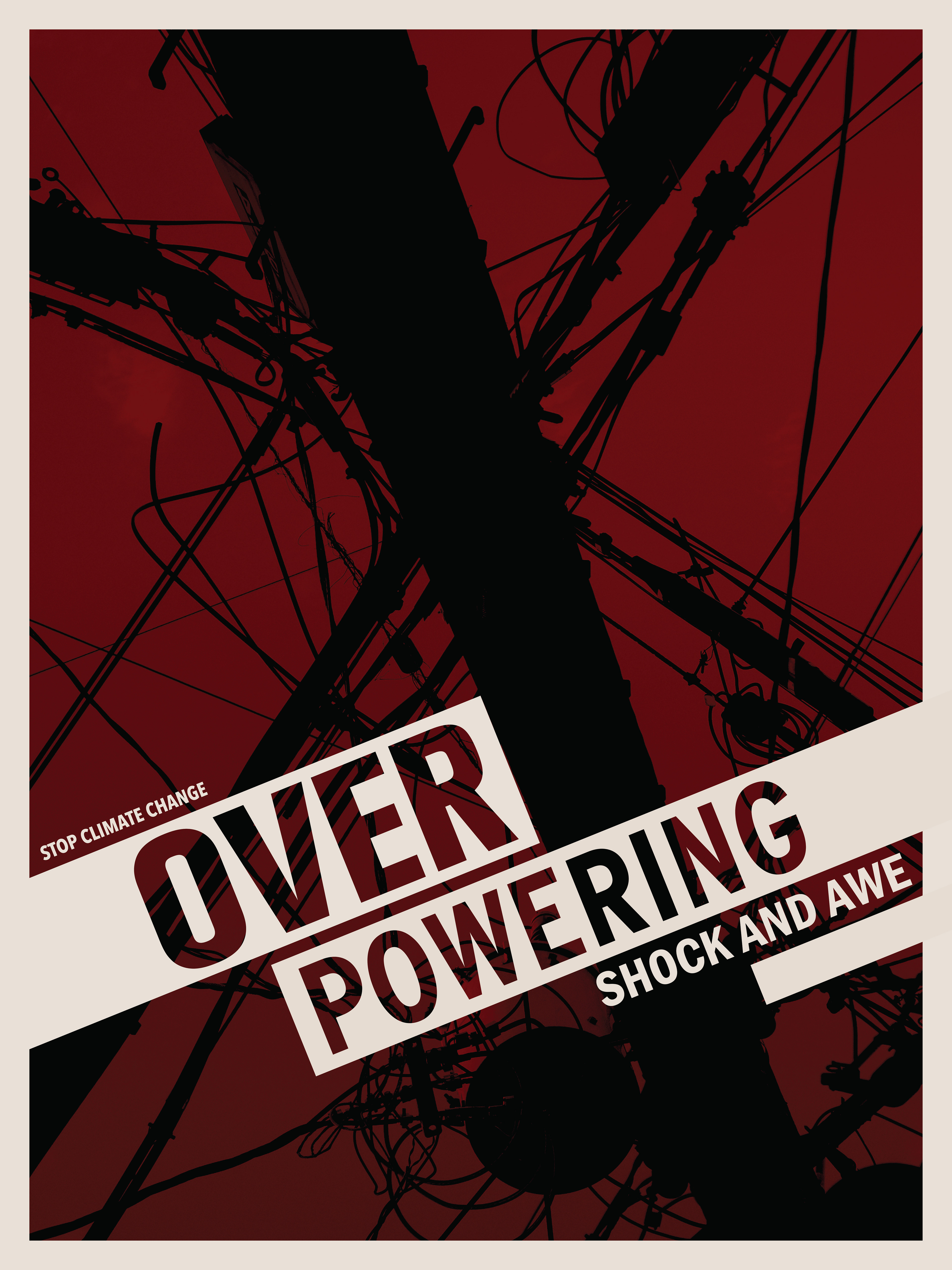

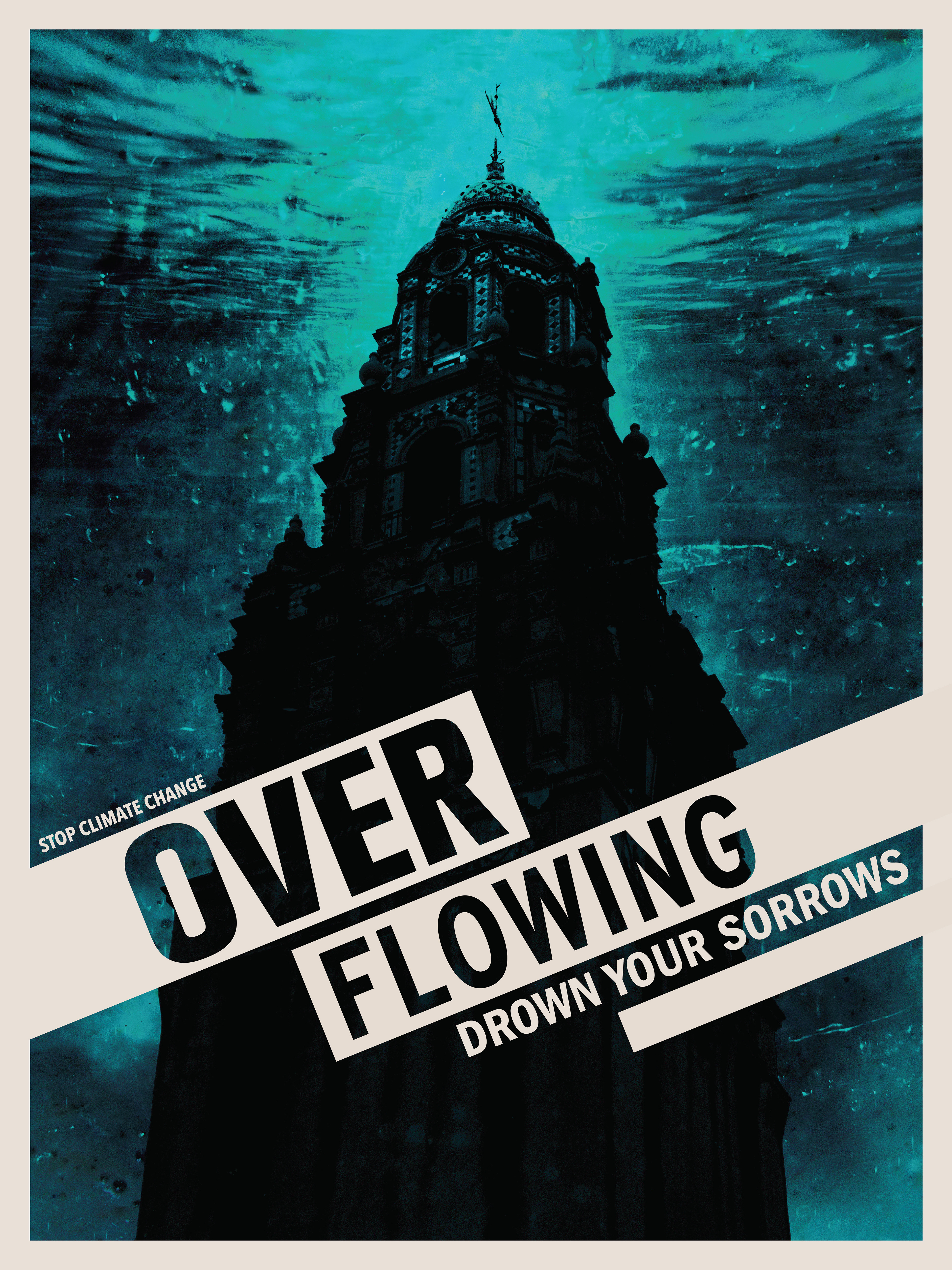
Stop Climate Change: This Project was assigned in Fall of 2023. The instruction was to create a 3-set design scheme to warn onlookers about the climate crises. I did a trip around the San Deigo area, and took photos of powerlines, trash, and local monuments. I edited the images with the intent to show a haunting visual of how pollution will affect us. The common phrases string along the posters like crime-scene tape.

Magazine Design
Masher Magazine is a hobbyist gaming magazine that questions how games affect the us and the world we share. The May 2023 issue is themed around pin the tail on the donkey. The issue also POKES fun at gamers, as they can be stubborn like donkeys. The magazine has a humorous and playful nature, with a clean structure, and properly formatted type. One of the challenges that I faced creating this magazine was not being able to use imagery from video games, as I wanted it to be 100% original visual content with each department and article being distinct.
Book Design
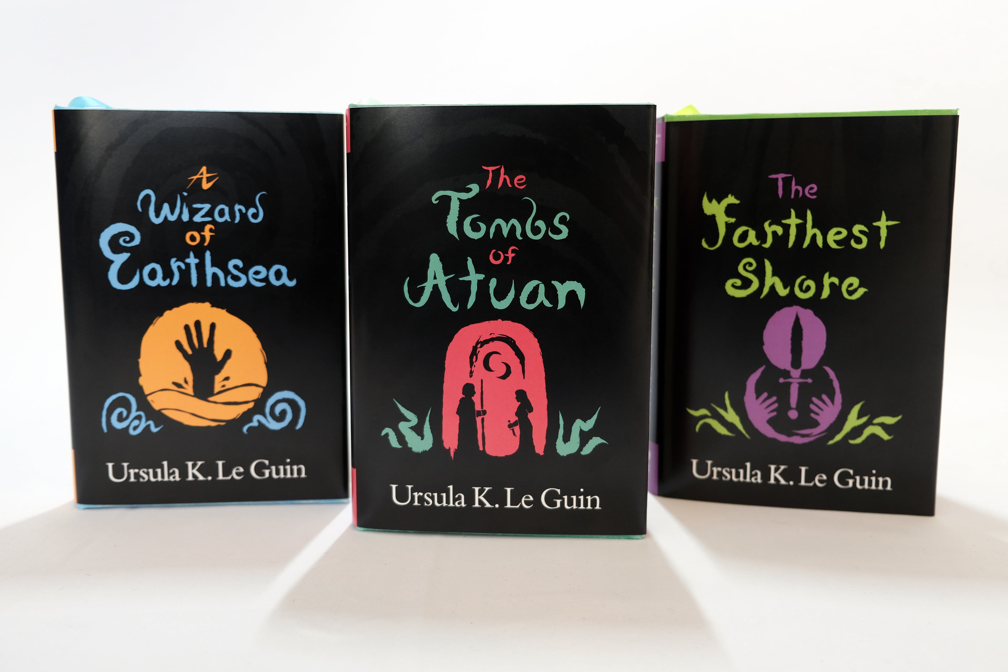
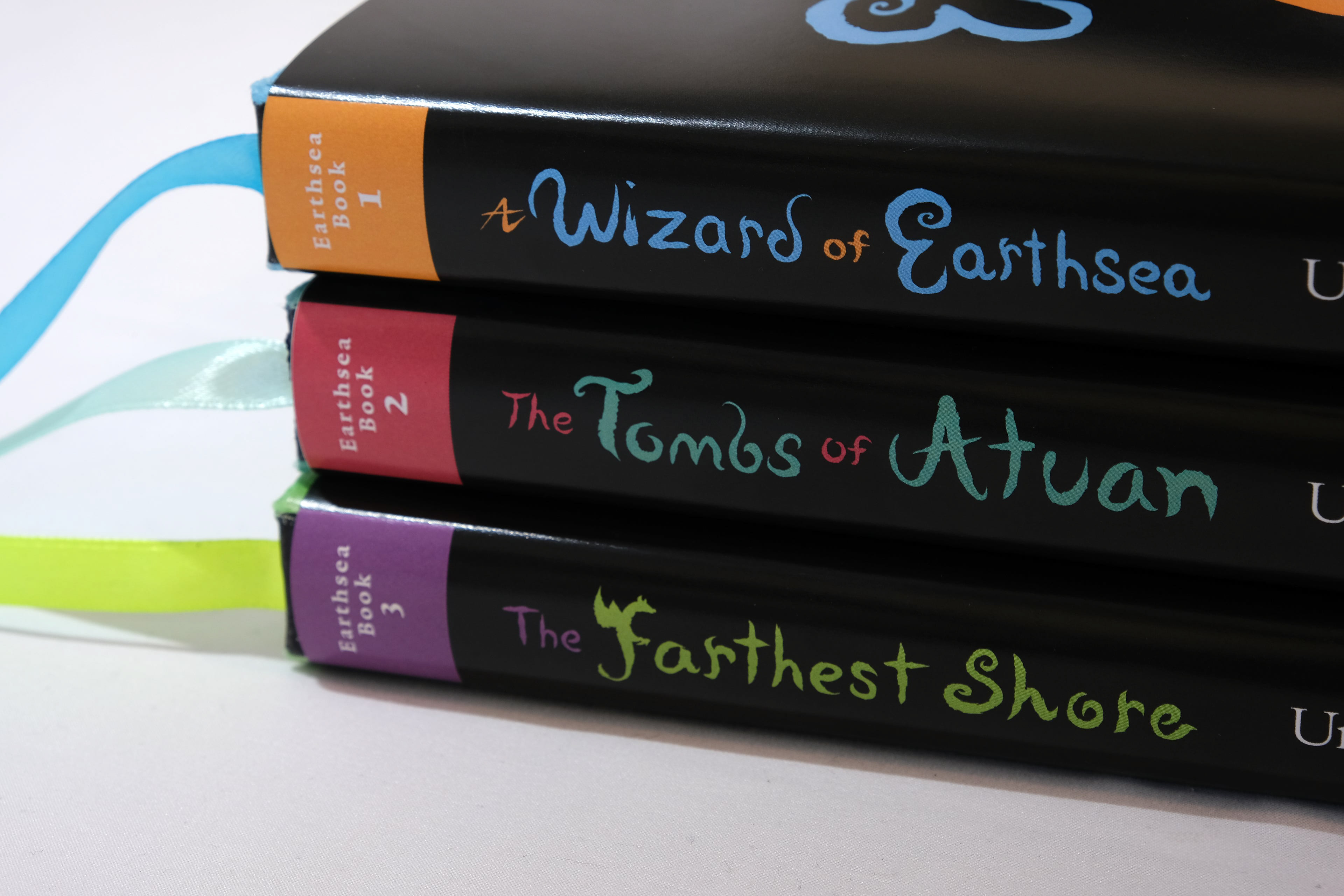
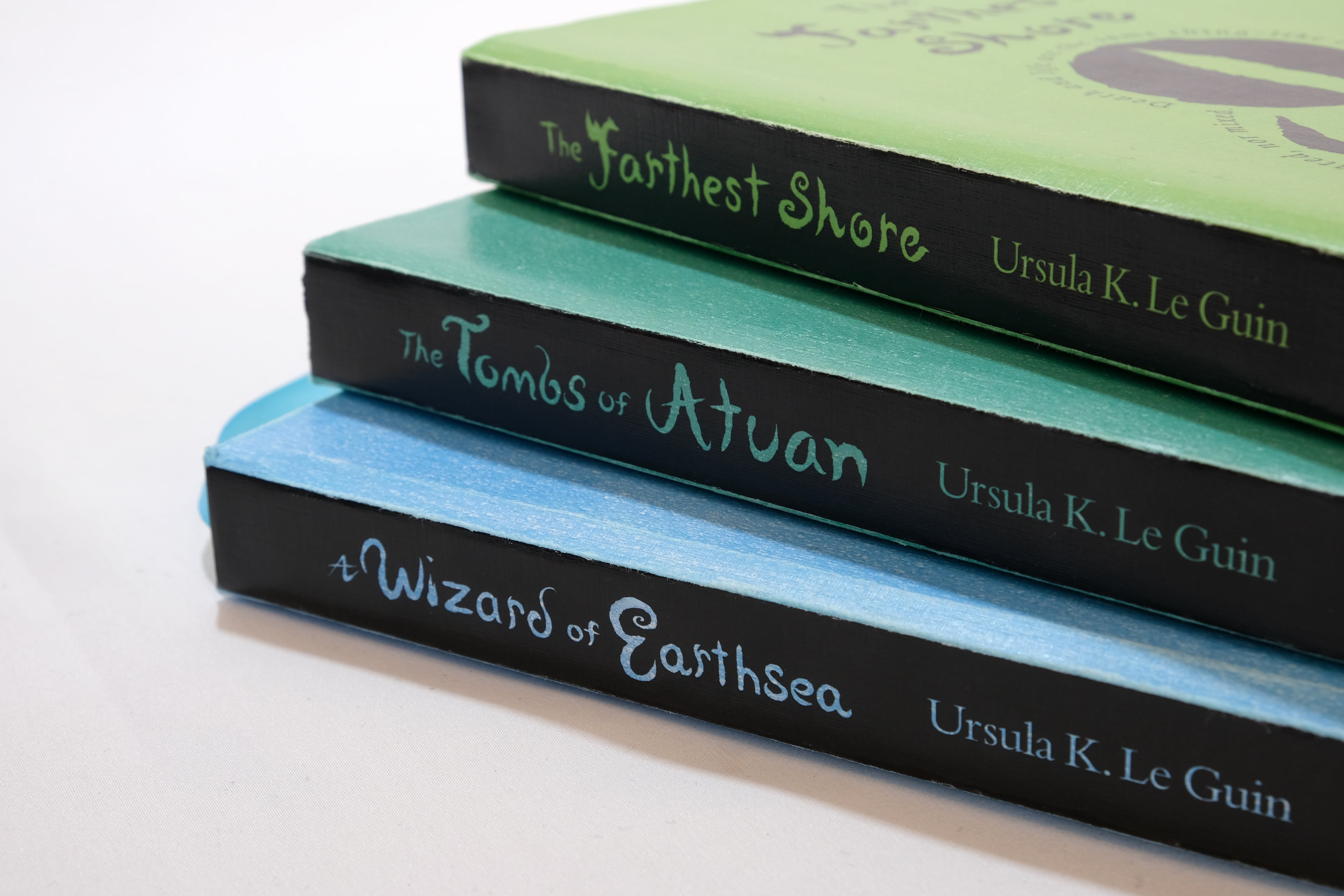
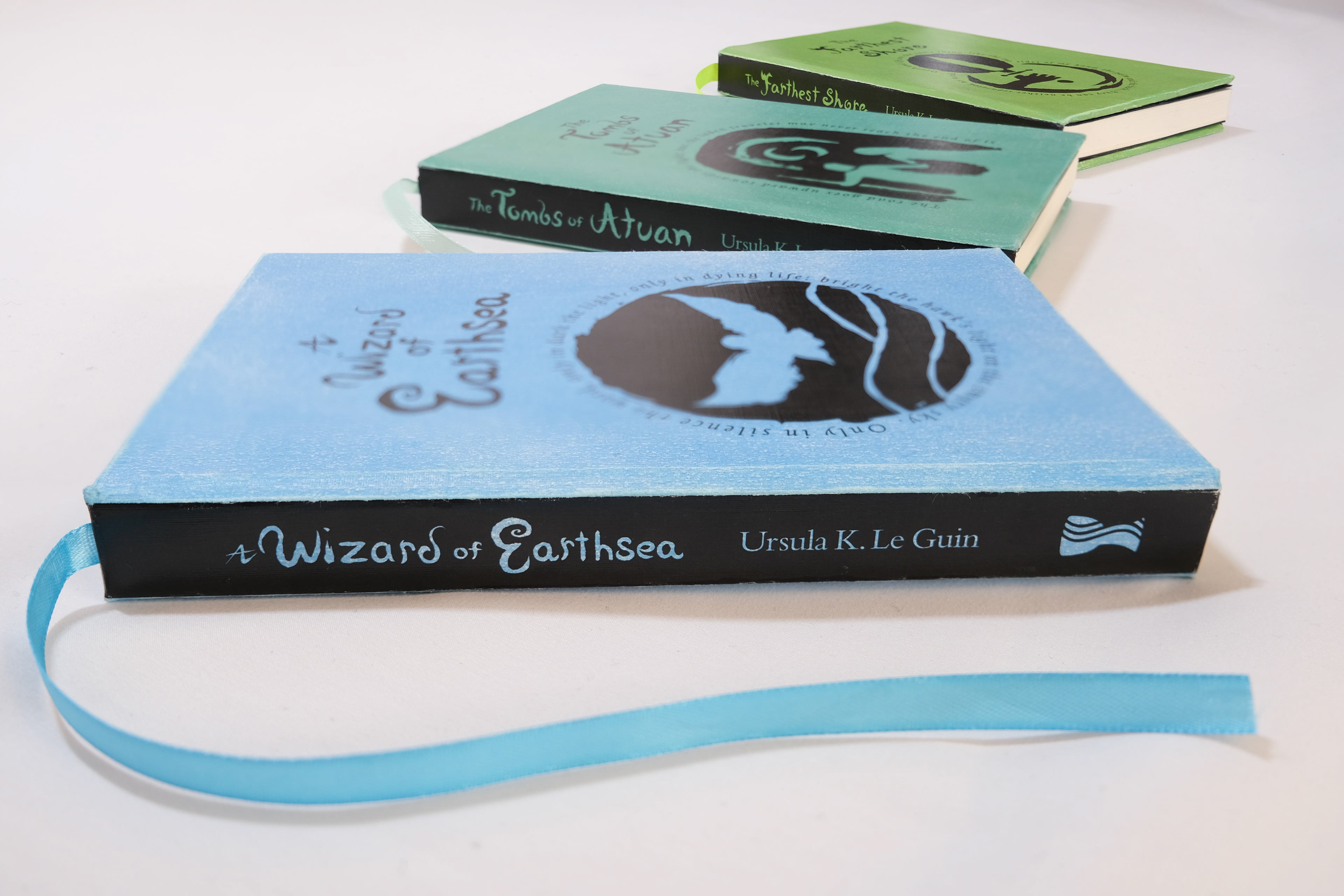
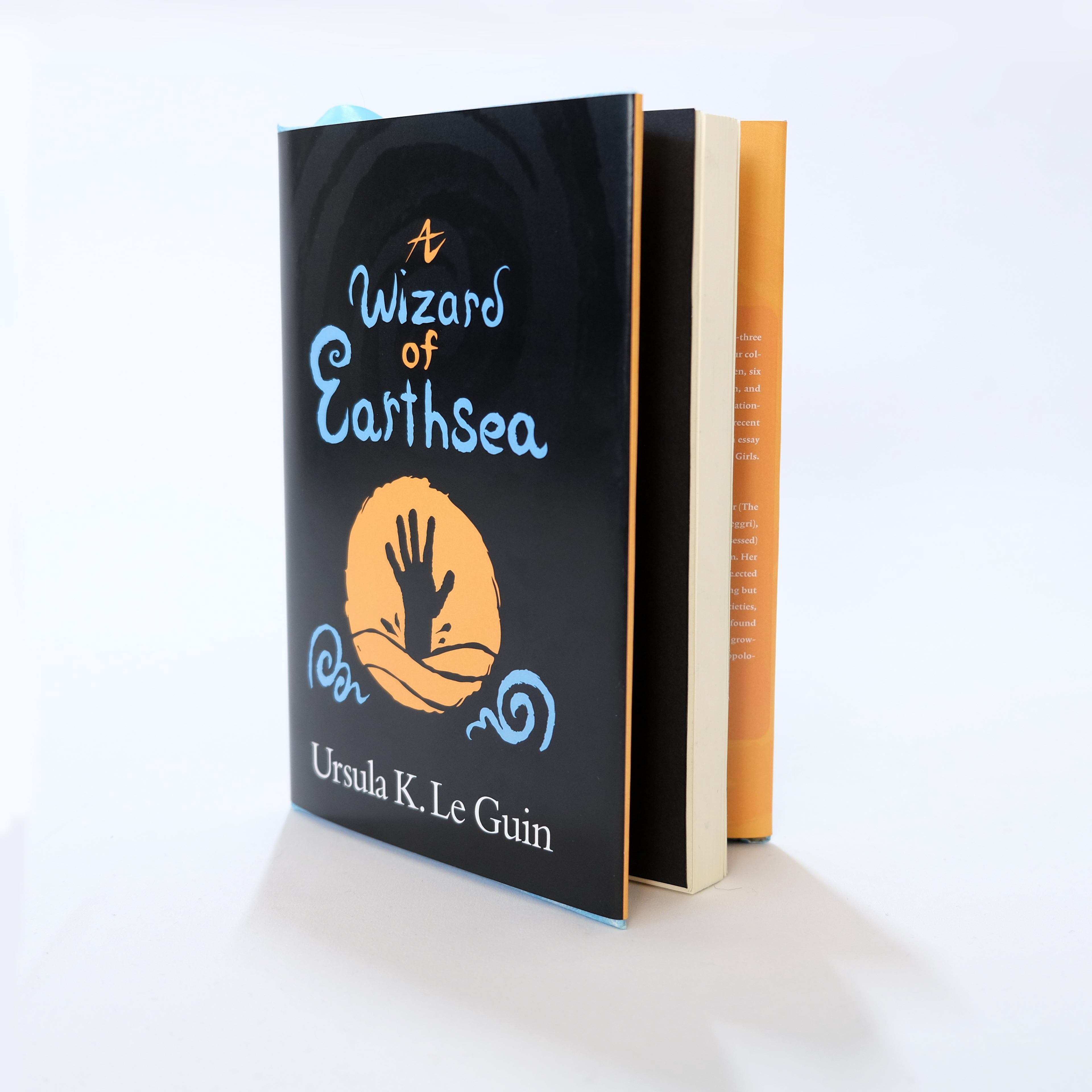
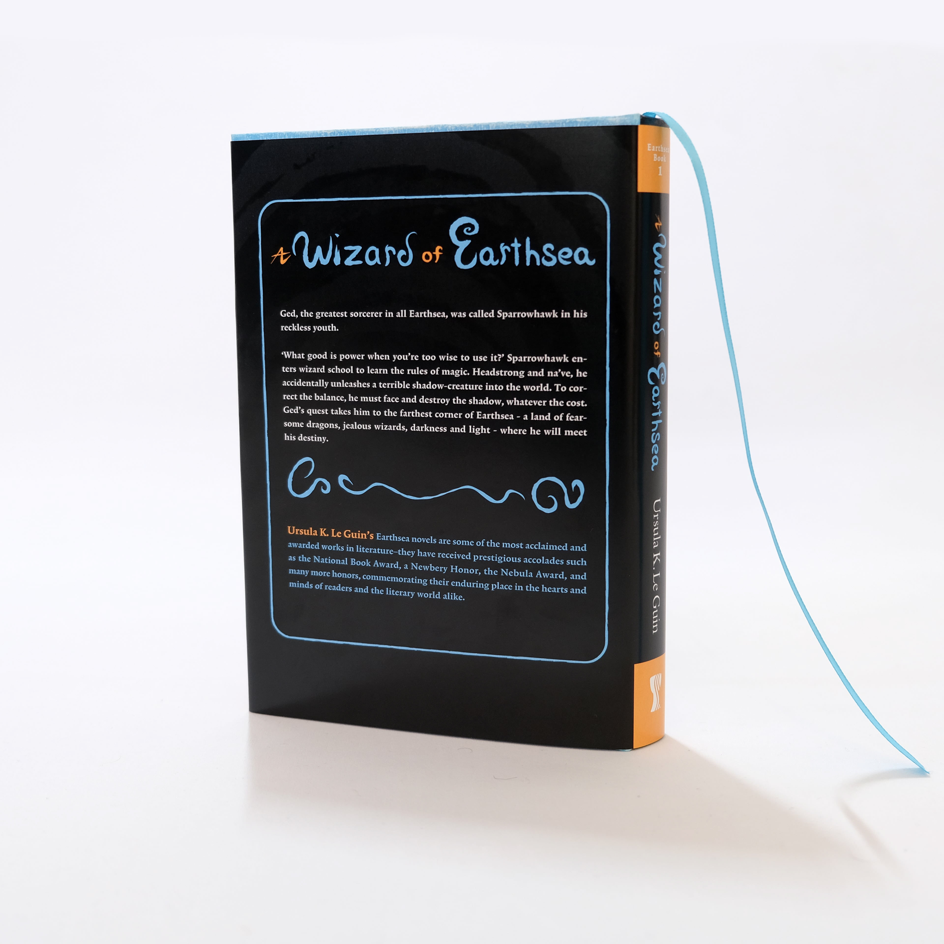
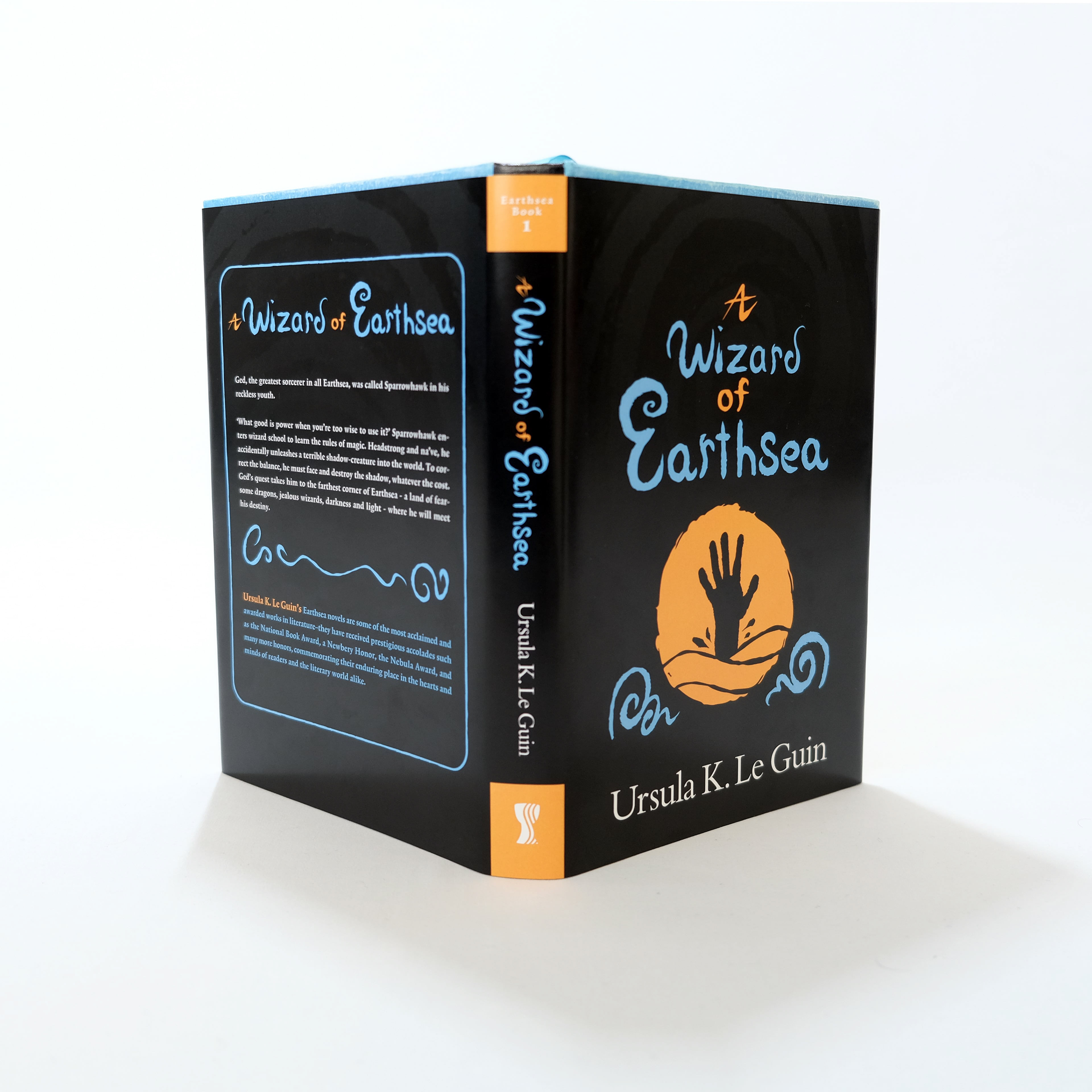
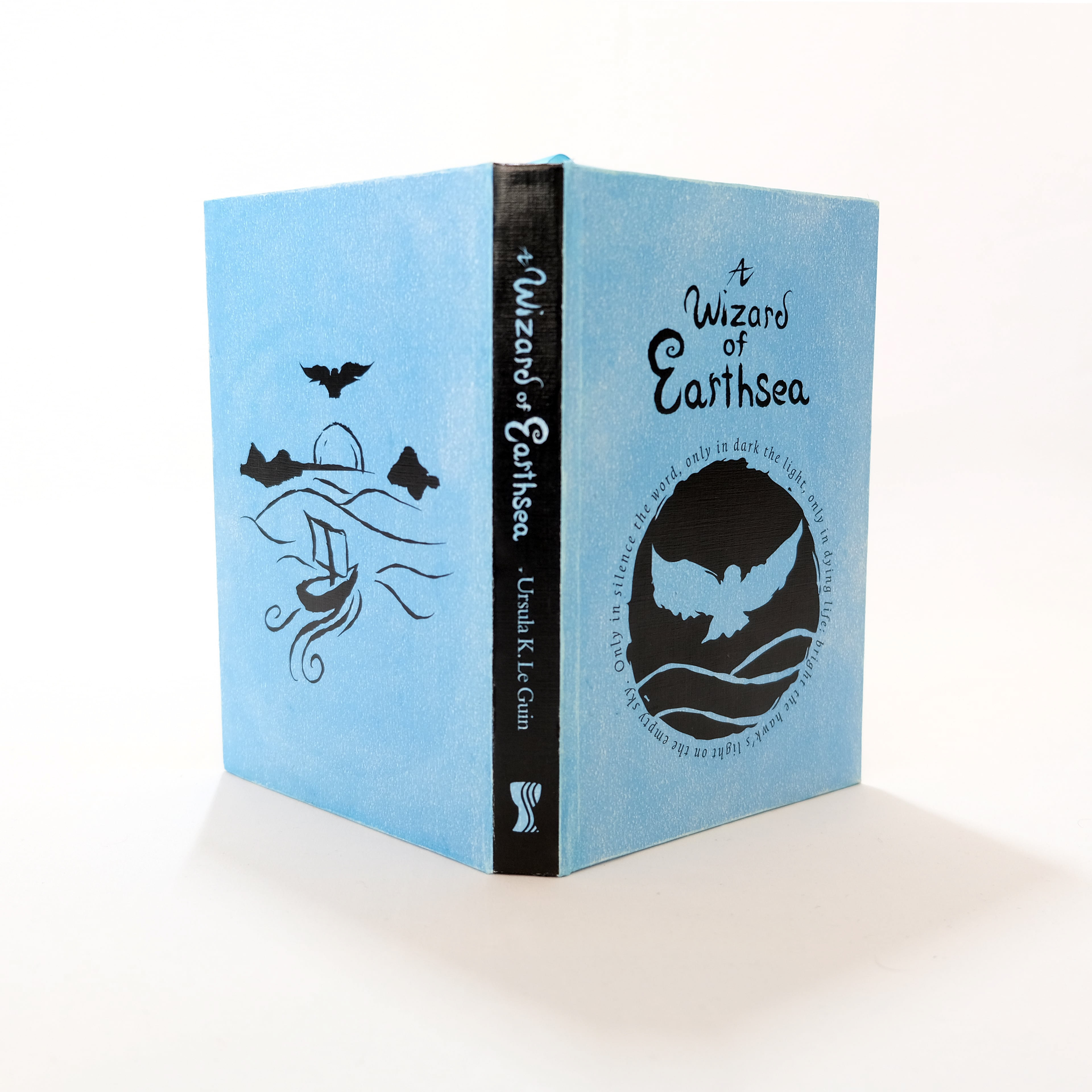
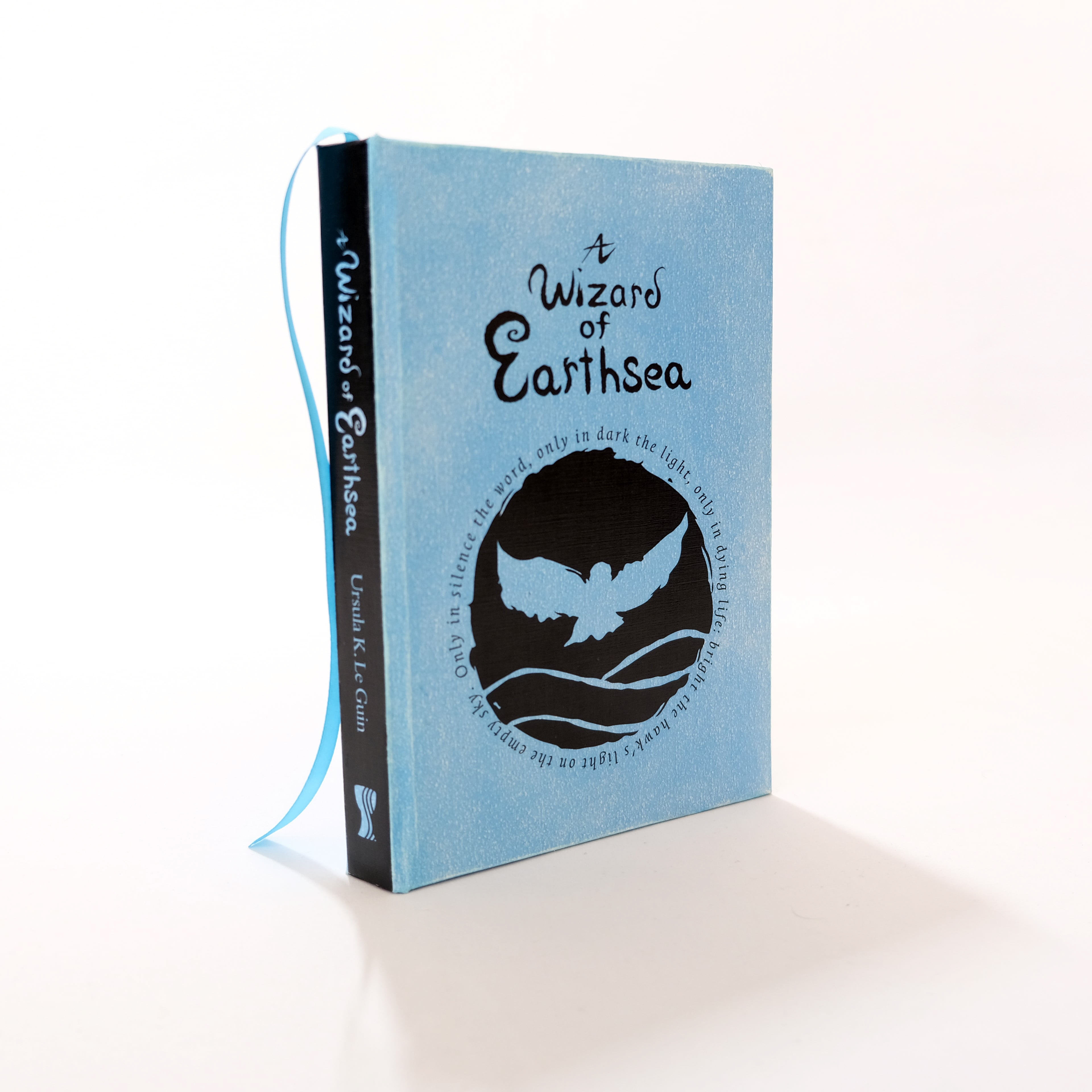
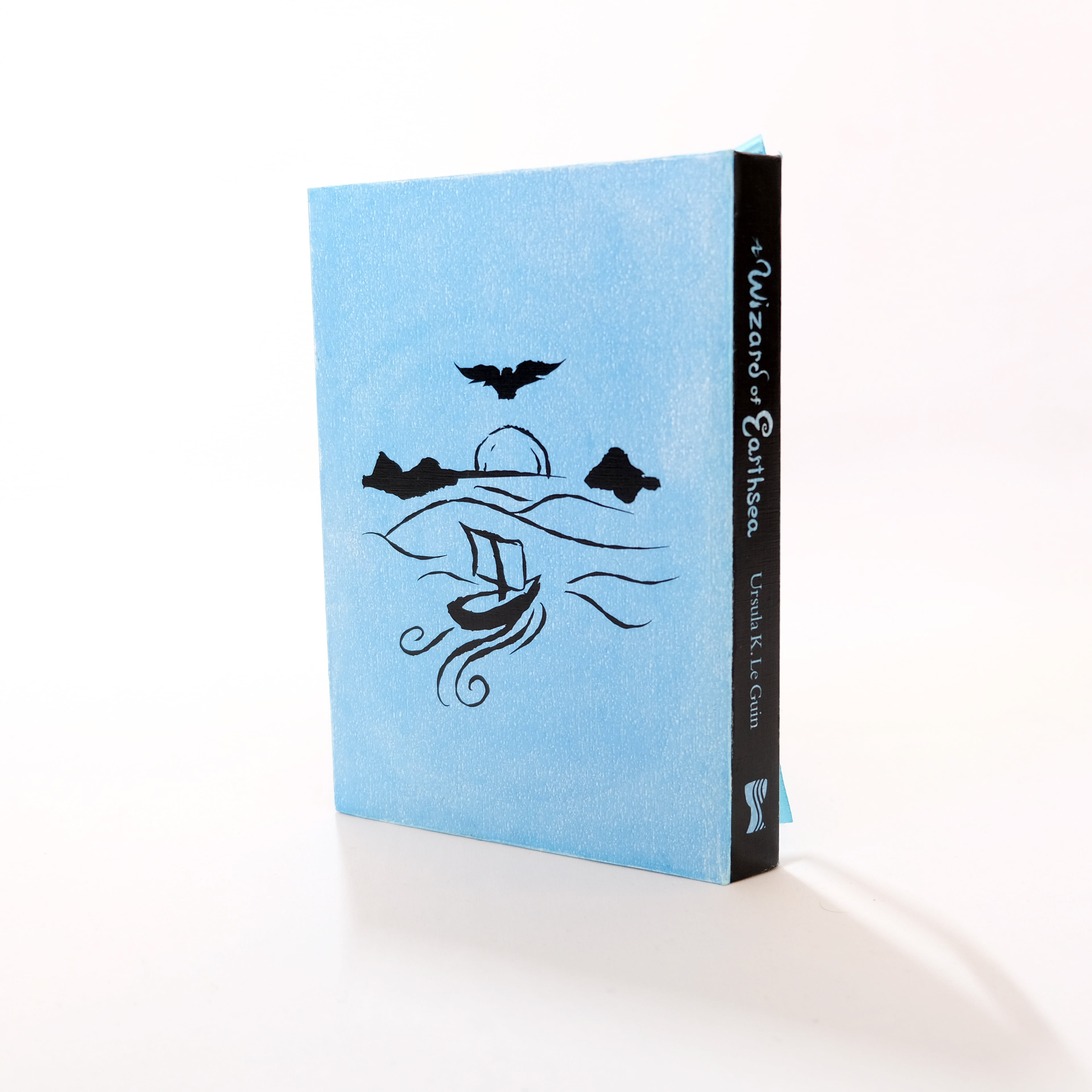
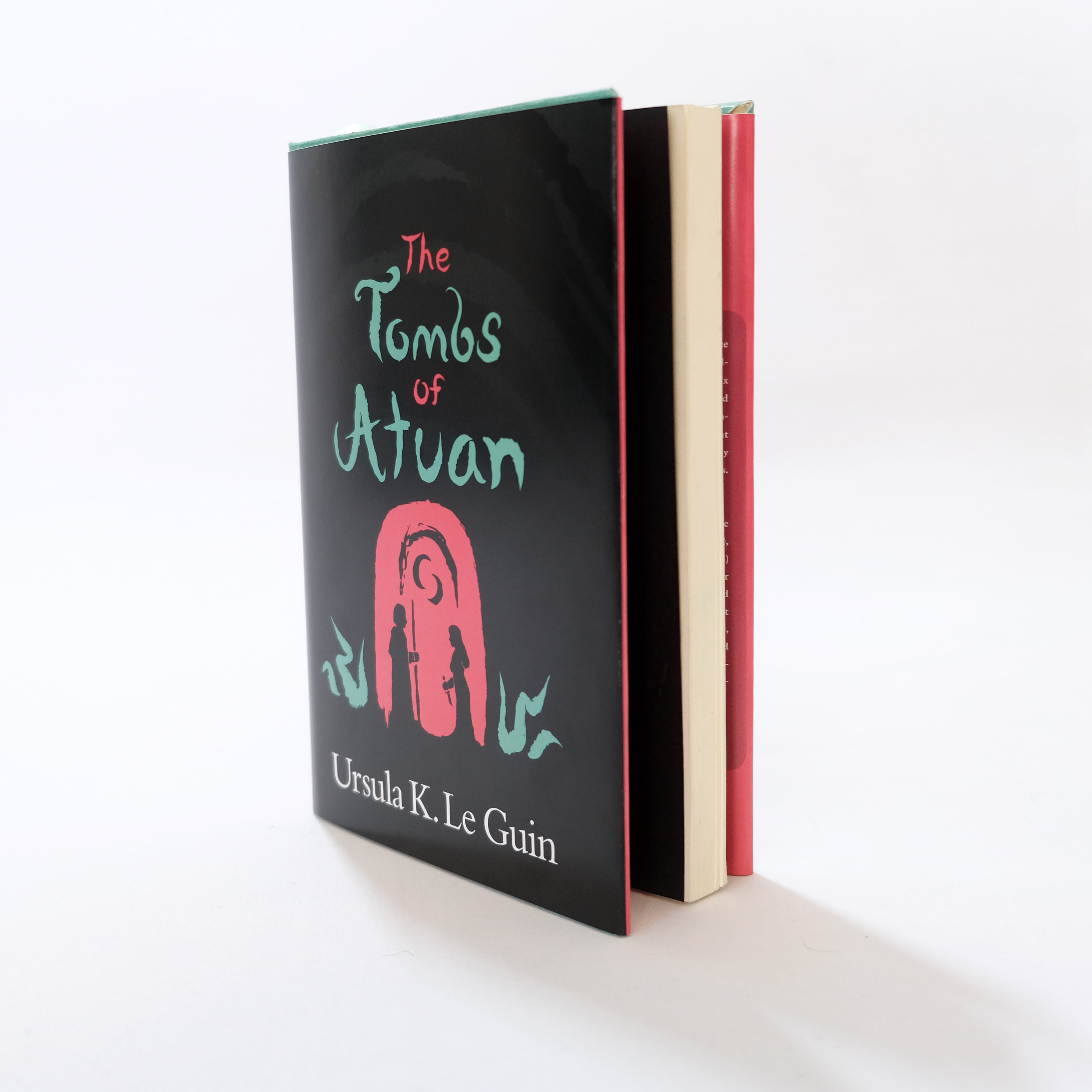
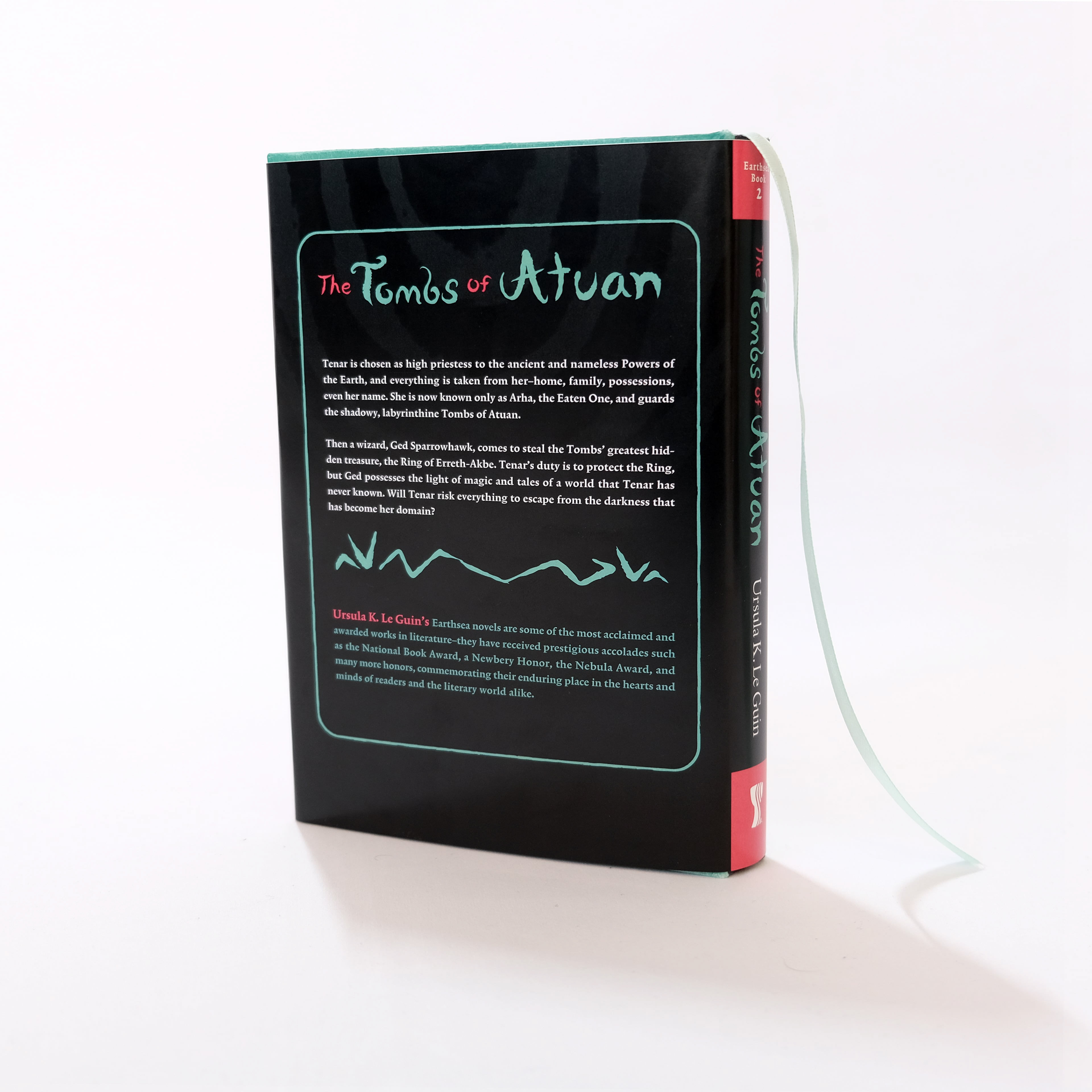
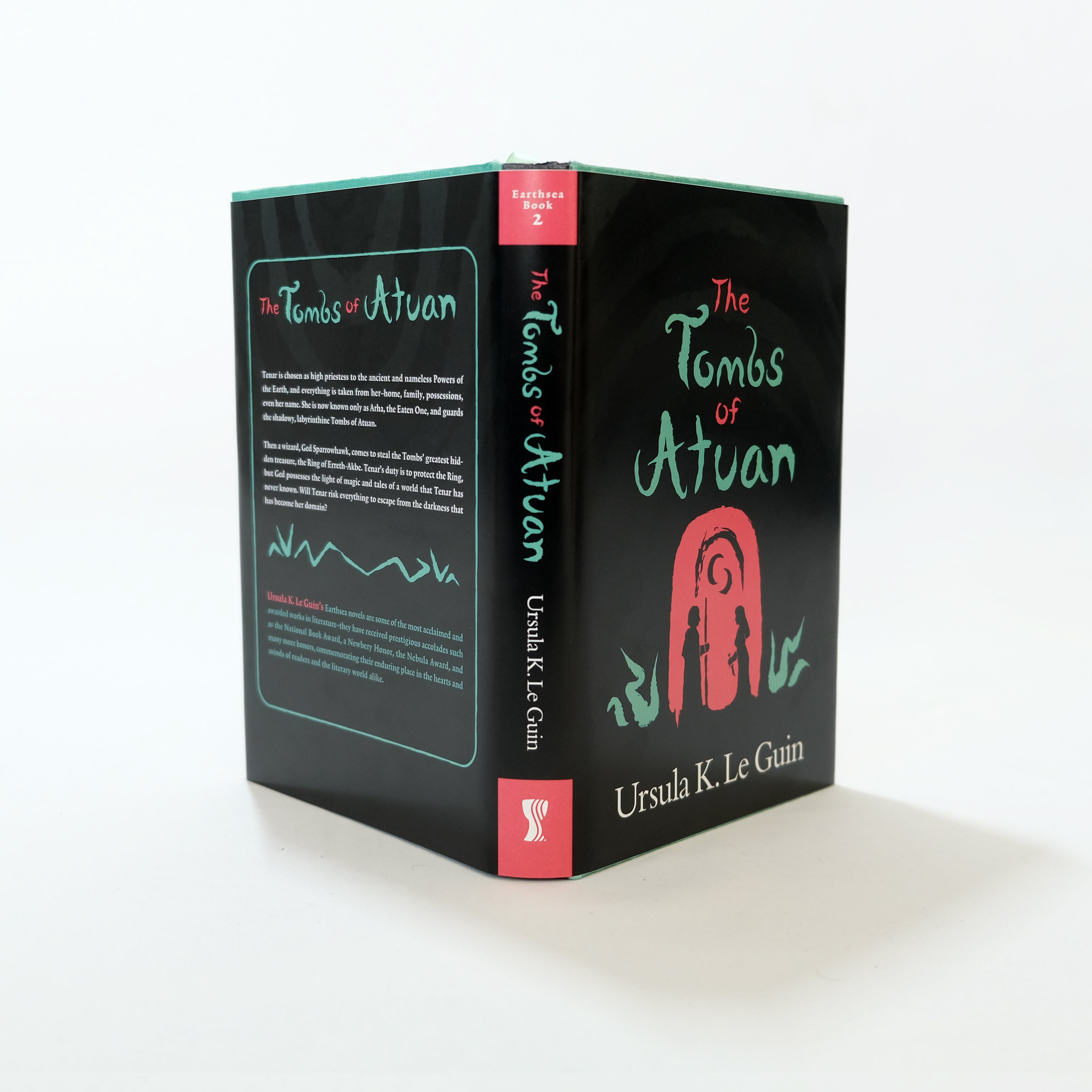
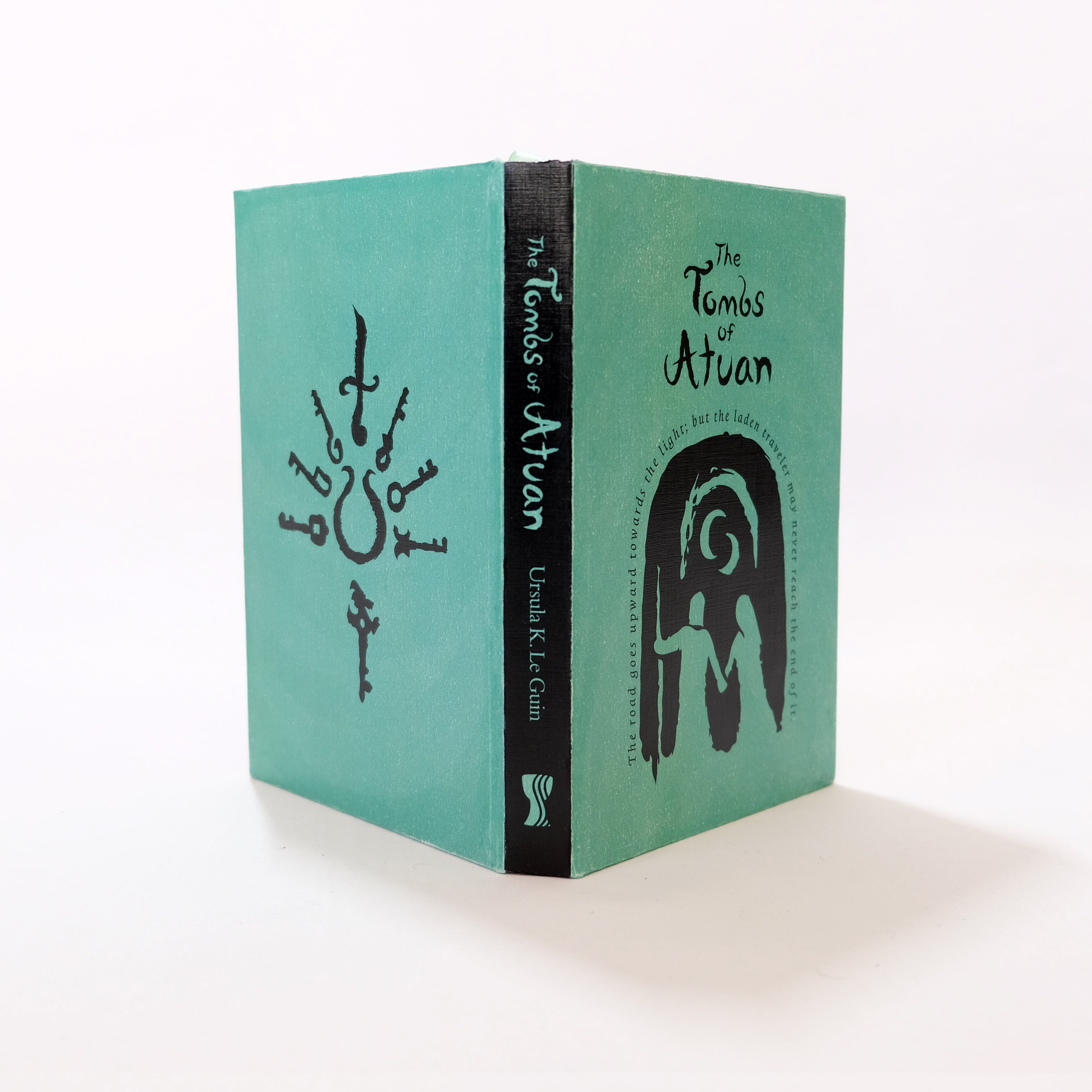
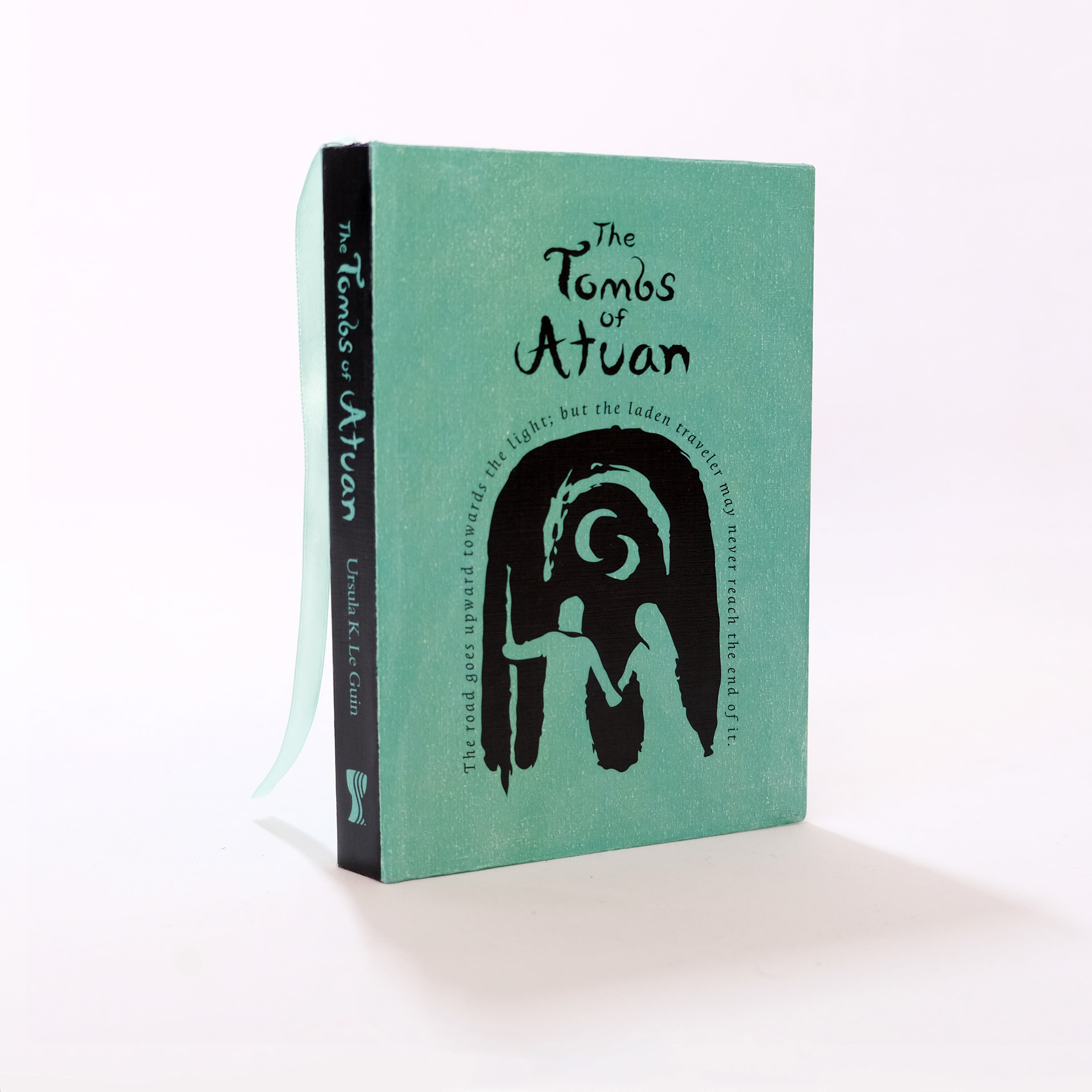
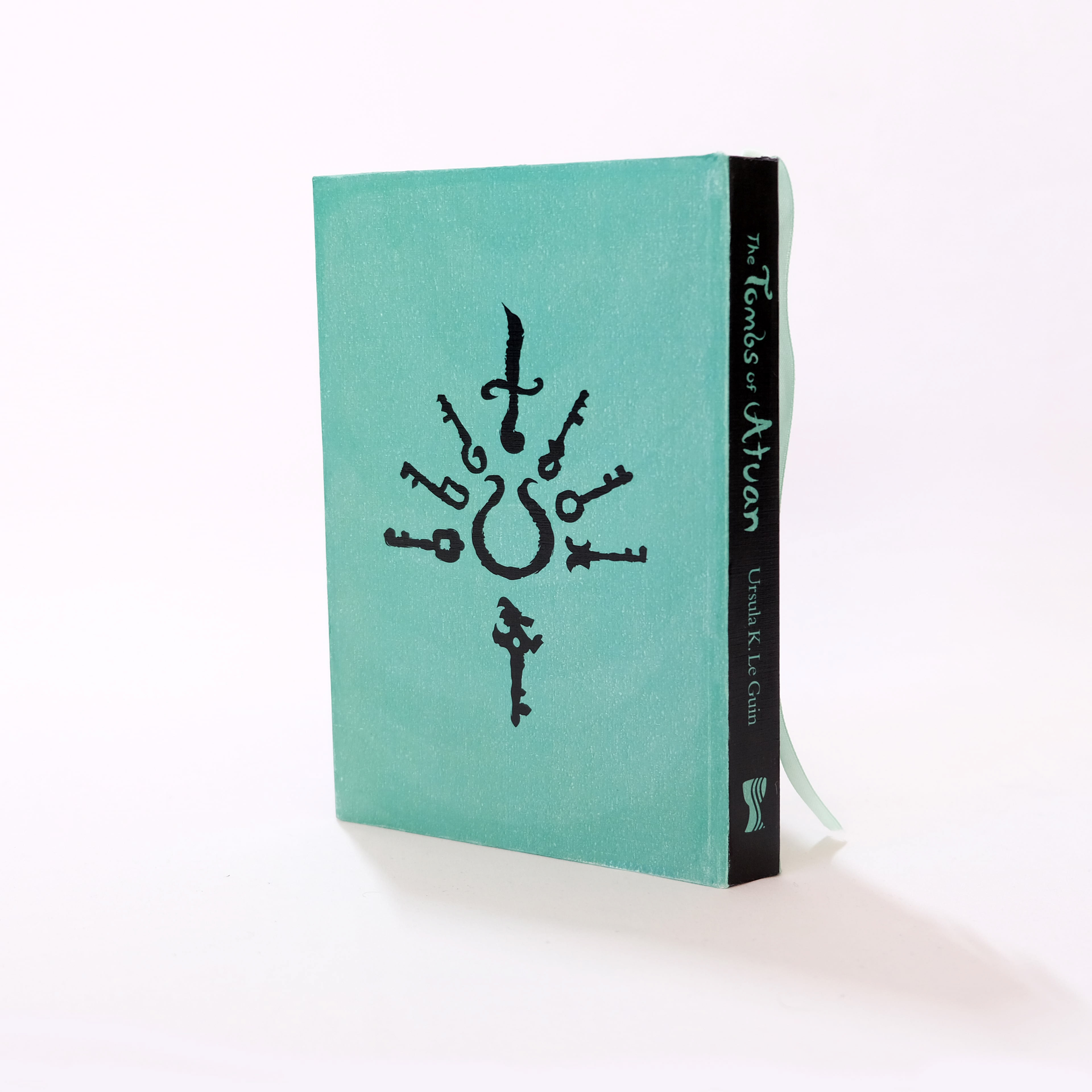
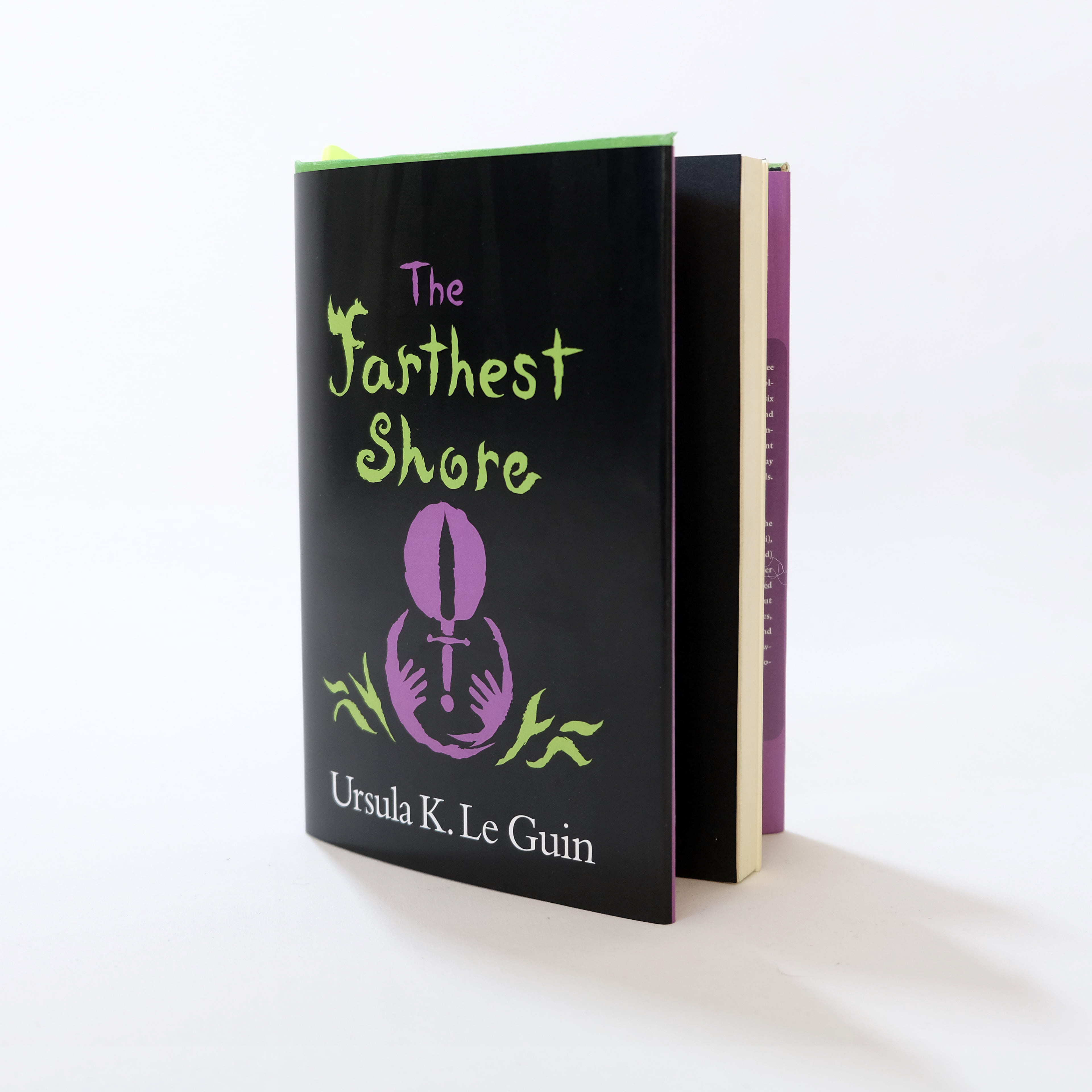
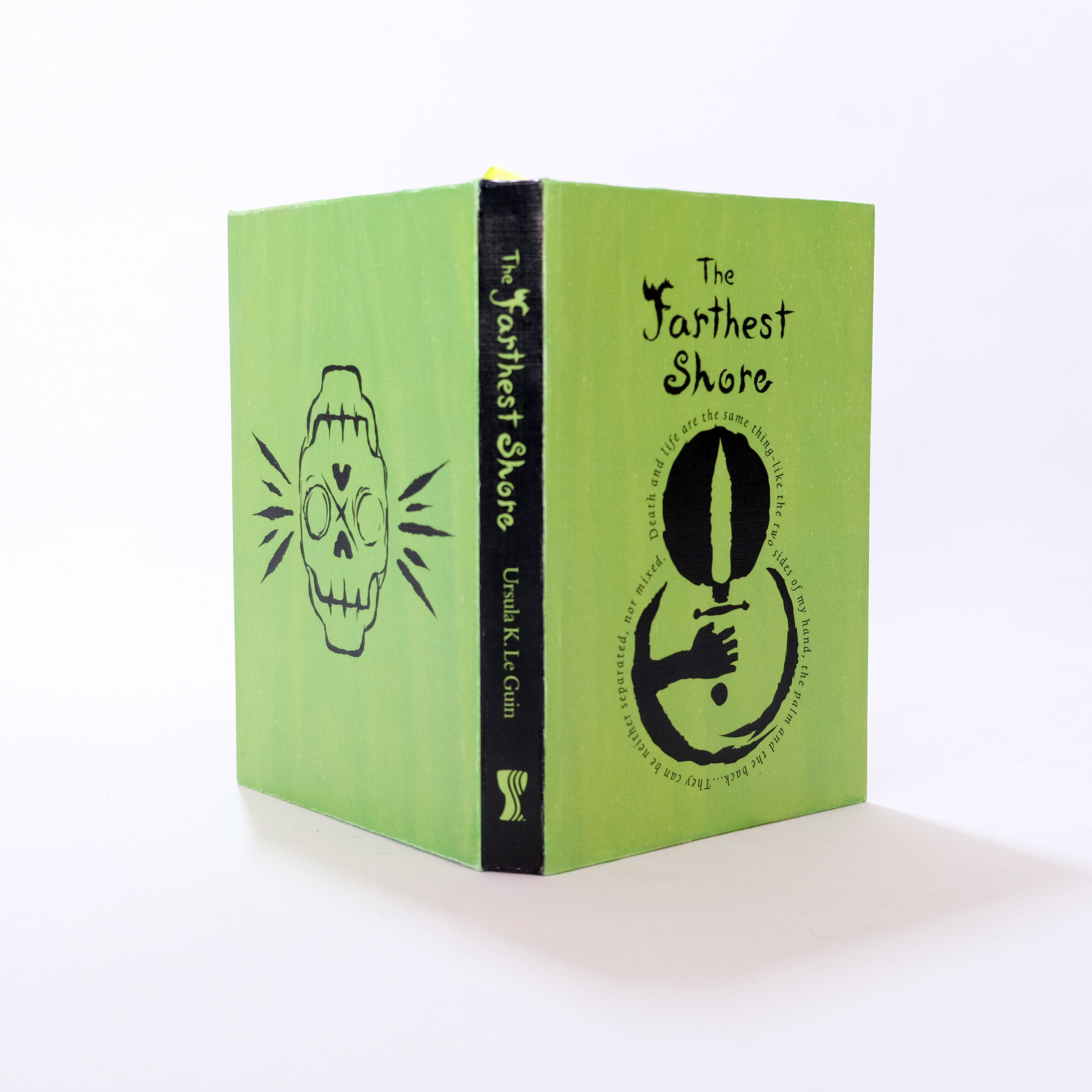
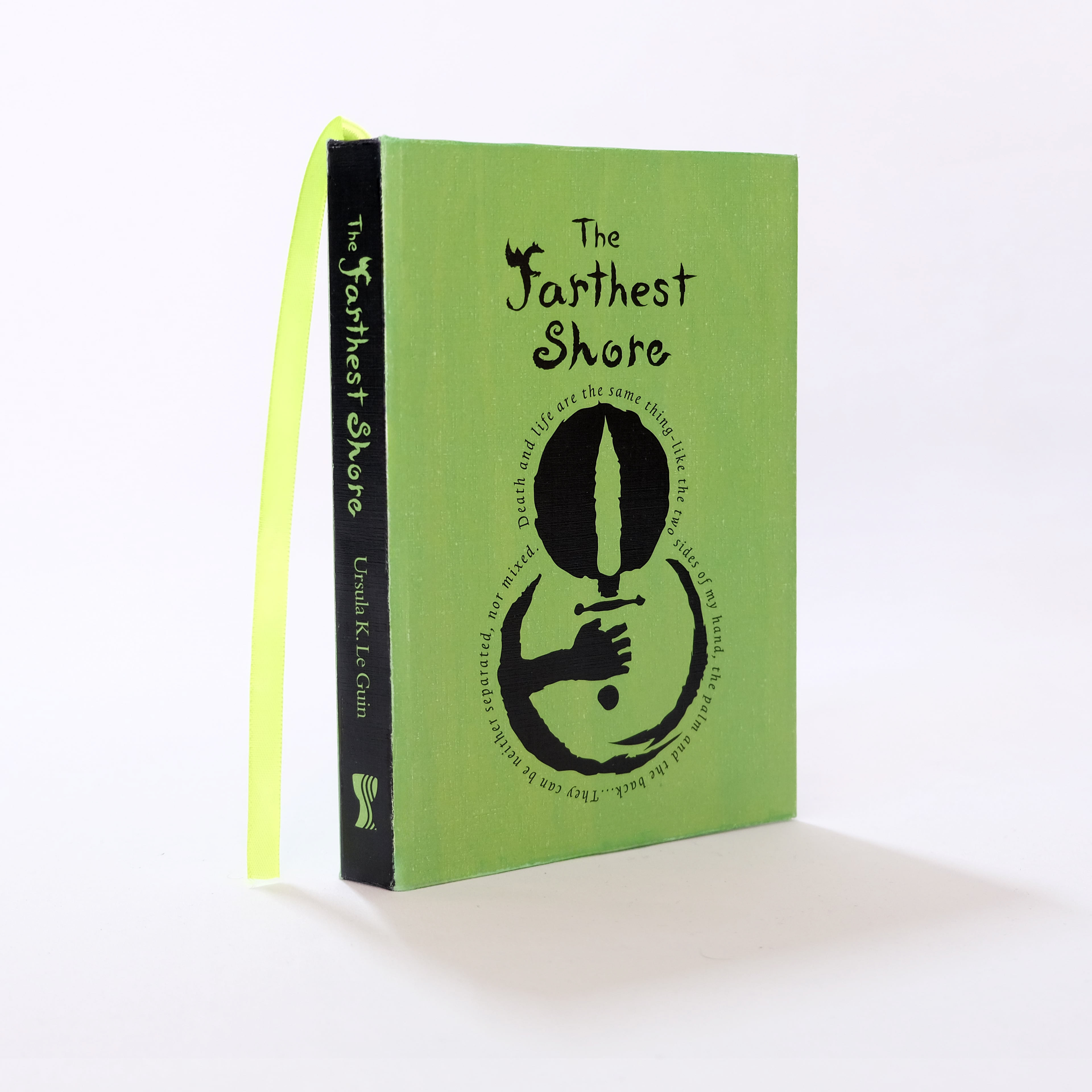
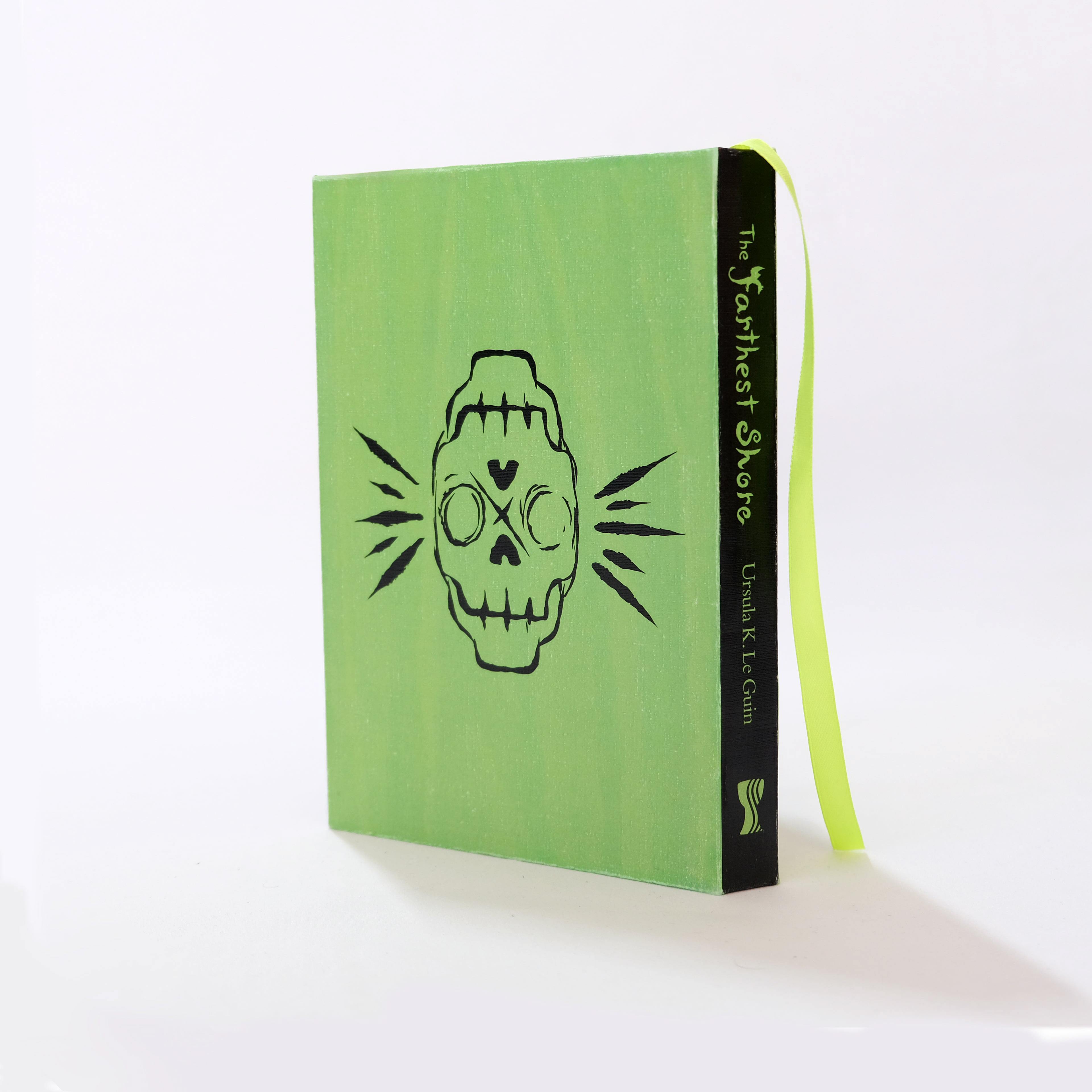
The Earthsea Trilogy is an American high fantasy classic, written by Ursula K. LeGuin. I chose to design the covers for this series, because of its impact on me as a young reader. Book covers for the series have been very illustrative and image heavy. I wanted to give the series the respect of a classic. The icons and titles are hand drawn digitally to mimic ink and linocut aesthetic. Consistency and simplicity were a design


Book 1
Wizard of Earthsea: The ink icons for this book illustrates the struggle and transformation of the main character's coming of age story. The drowning hand reaching for the sky, once the sleave is removed, becomes a soaring hawk. The image on the back of the book is an establishing drawing of earthsea, showing a boat sailing into the sunset giving an idea of the journey that awaits.
Book 2
The Tombs of Atuan: The ink icons for this book illustrate the conflict resolution of the two main characters within the dark tombs. On the sleeve they are facing each other, and the book illustrates them holding hands to navigate their way through the darkness. The icon on the back of the book is a dagger and 7 keys, which the protagonist carries when exploring the tombs.
Book 3
The Farthest Shore: The imagery on the sleeve and cover shows the conflict of life and death, resembling an eclipse, and the sword creating the iris of a dragon's eye. With the sleeve, two hands are reaching for the sword, and the book shows on hand grasping it. The skull on the back illustrates the death obsessed antagonist of the book, who has become mentally and physically twisted in the pursuit of immortality.
Hofmann - Book Design
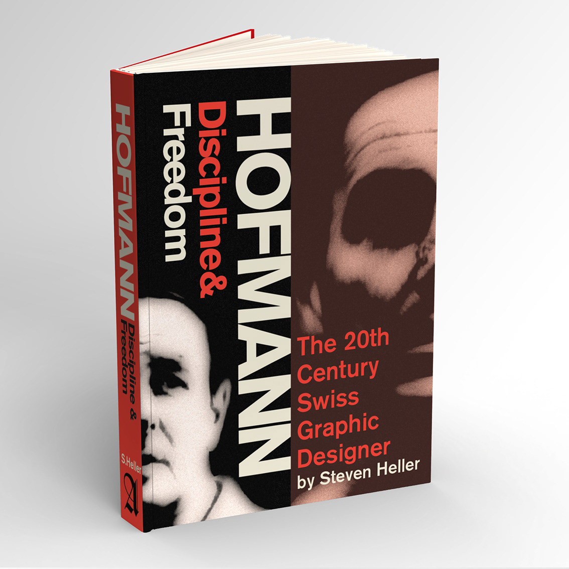

The design approach for HOFMANN was greatly inspired by his work and the swiss movement, of which he was a key player of. The title Discipline & Freedom is derived from his belief that great graphic design is a balance of those two qualities.
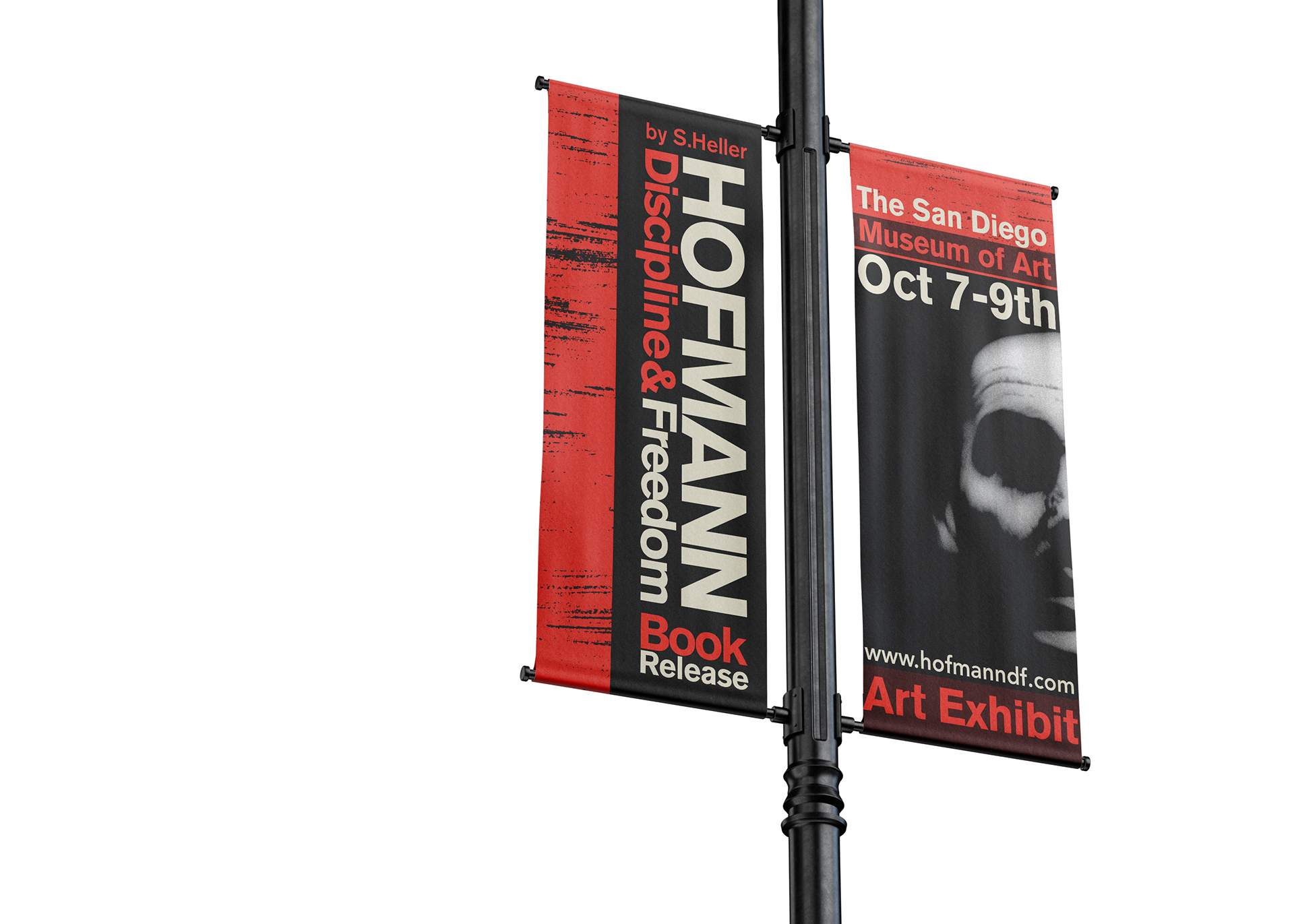
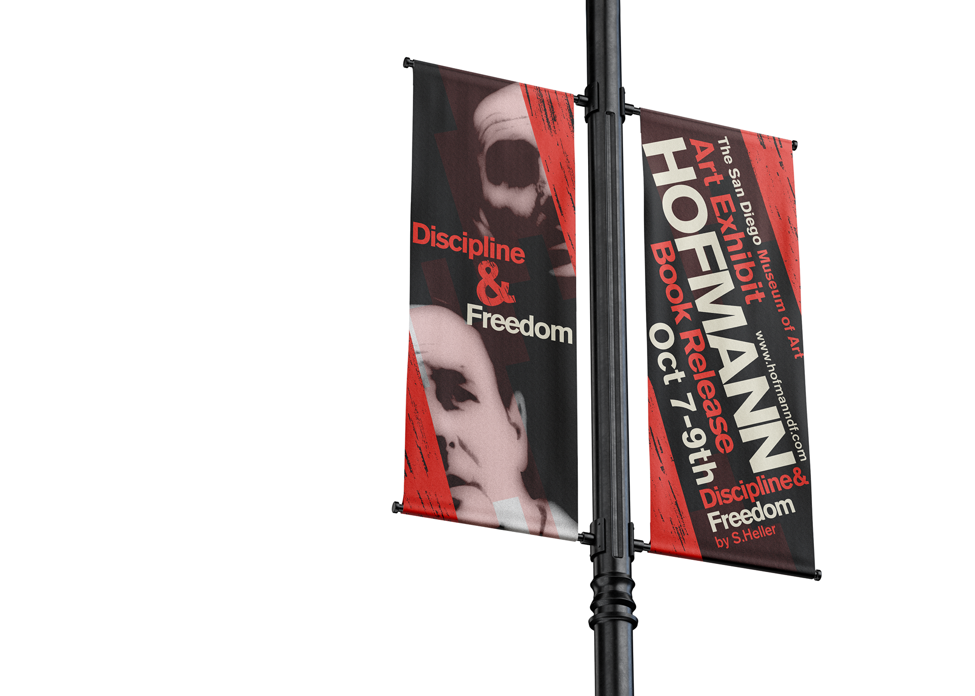
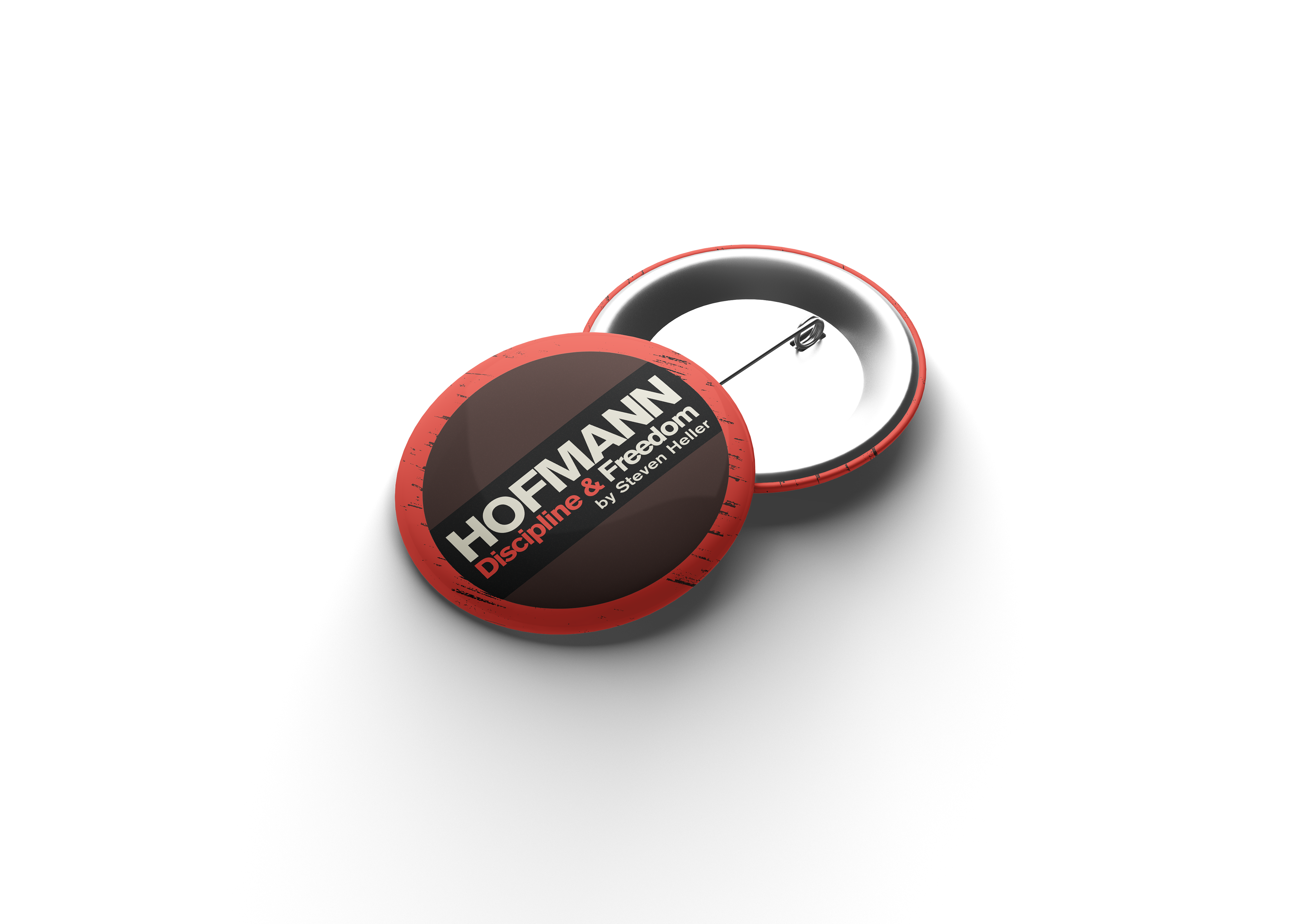
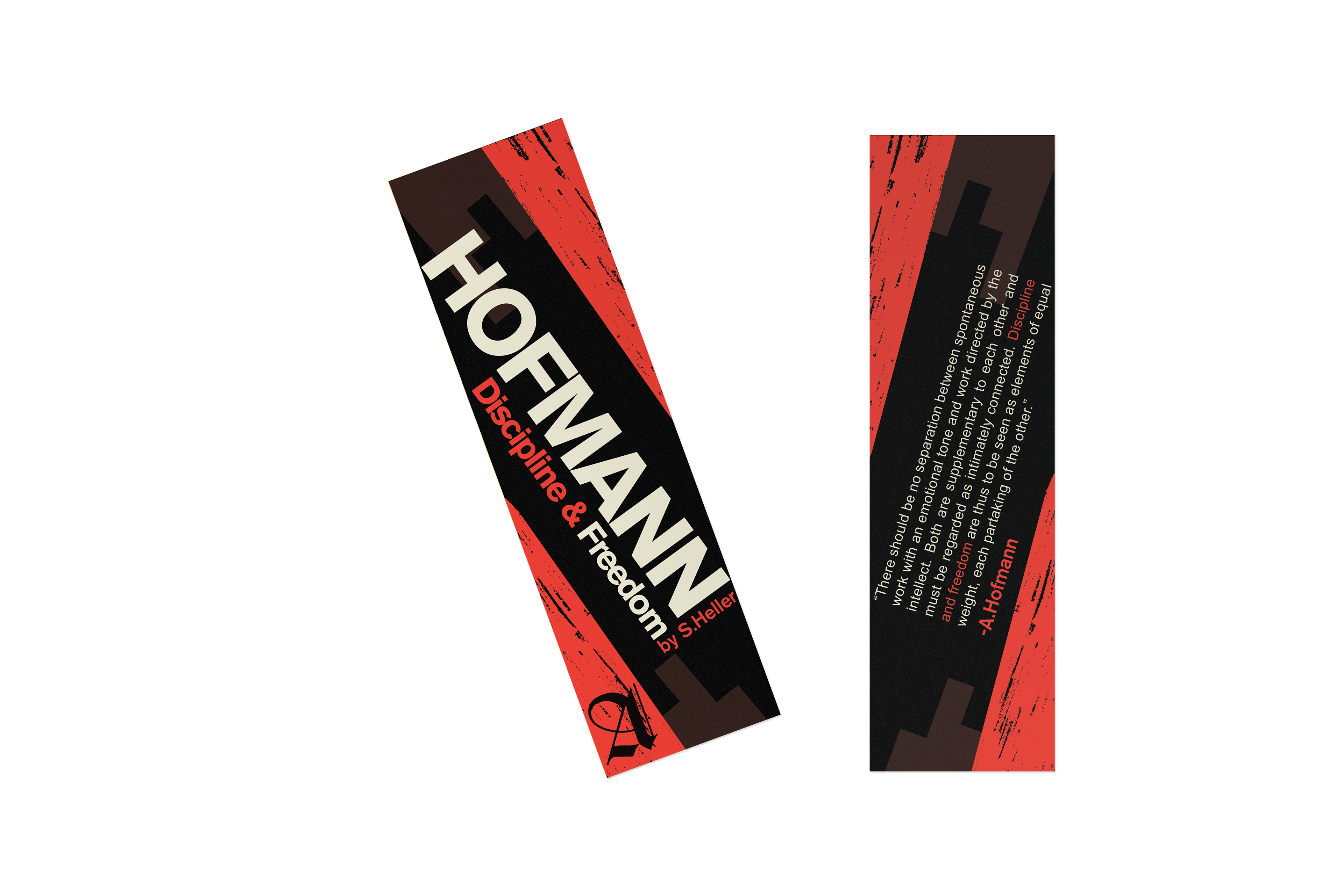

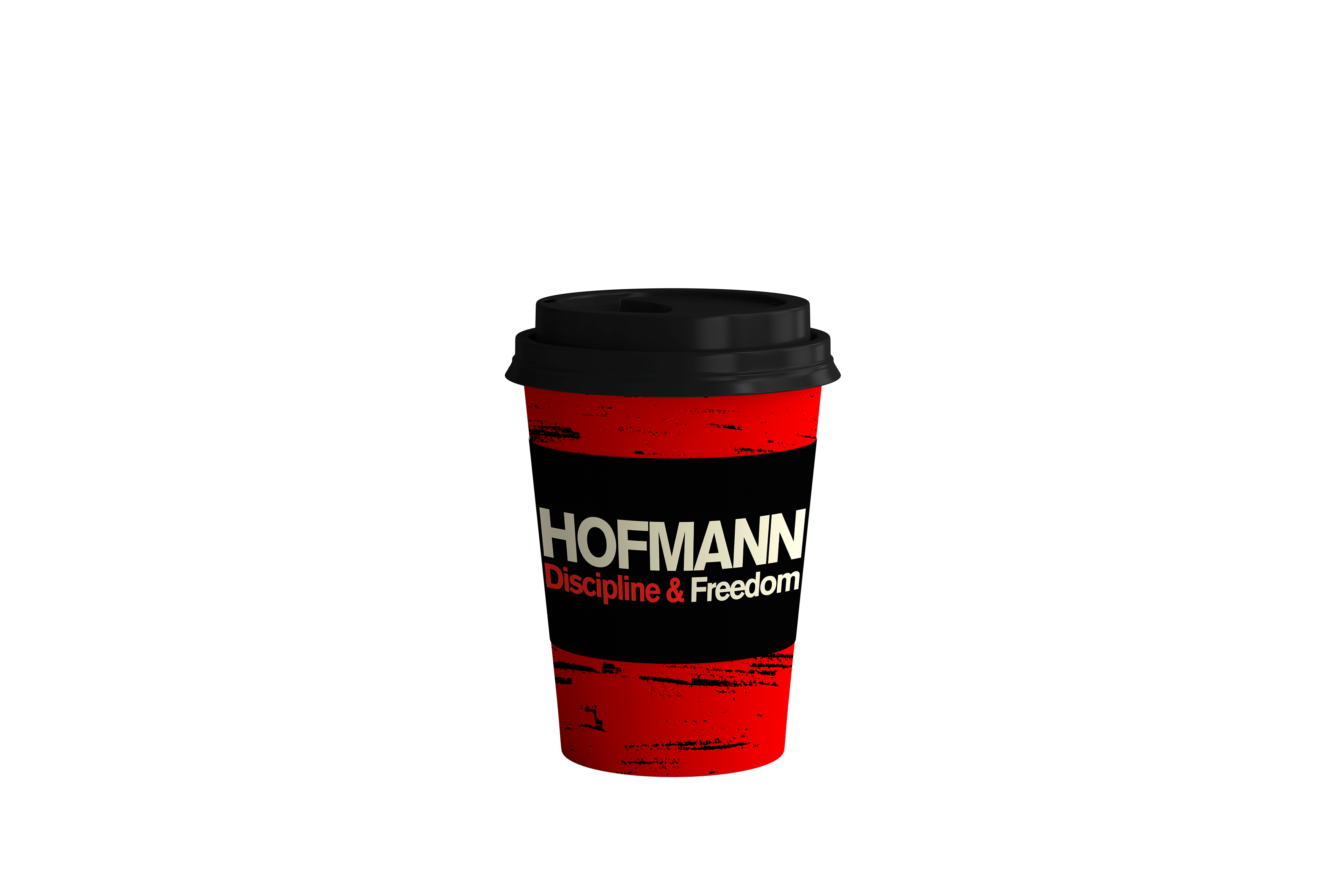
Marketing Collateral designed for the HOFMANN book release including buttons, bookmarks, cups, flags, and stickers

