This project received a silver award from Graphis, recognized by a jury and featured in their annual publication.
This branding project was initiated by my interest in skate and street culture. I was determined to create a brand that was thought out at all visual and verbal levels. The starting point was establishing what the brand is, and who is it for.
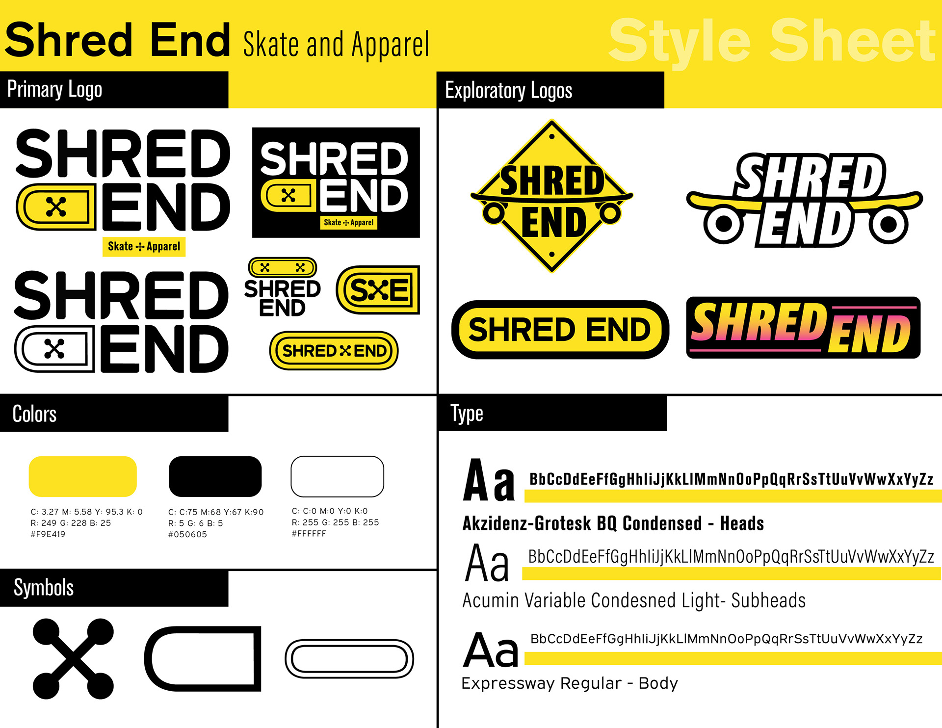
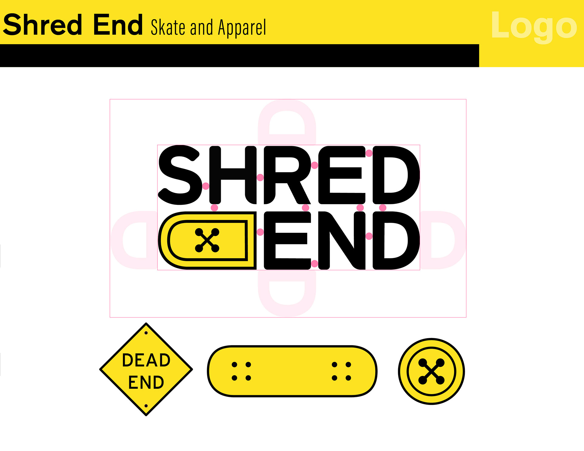
The Logo design took into consideration of what the brand is, being a skate and apparel brand. The reason for yellow being the dominant brand color, is because it correlates with the Dead-End sign, and it correlates with rebellion under the brand archetypes. I explored different logo approaches, considering the importance of visual clarity and readability
The logo is a fusion of 3 simple elements that are foundational to the brand. The type used was Interstate mono, I modified the type to be rounded and sharp to relate to skateboarding.
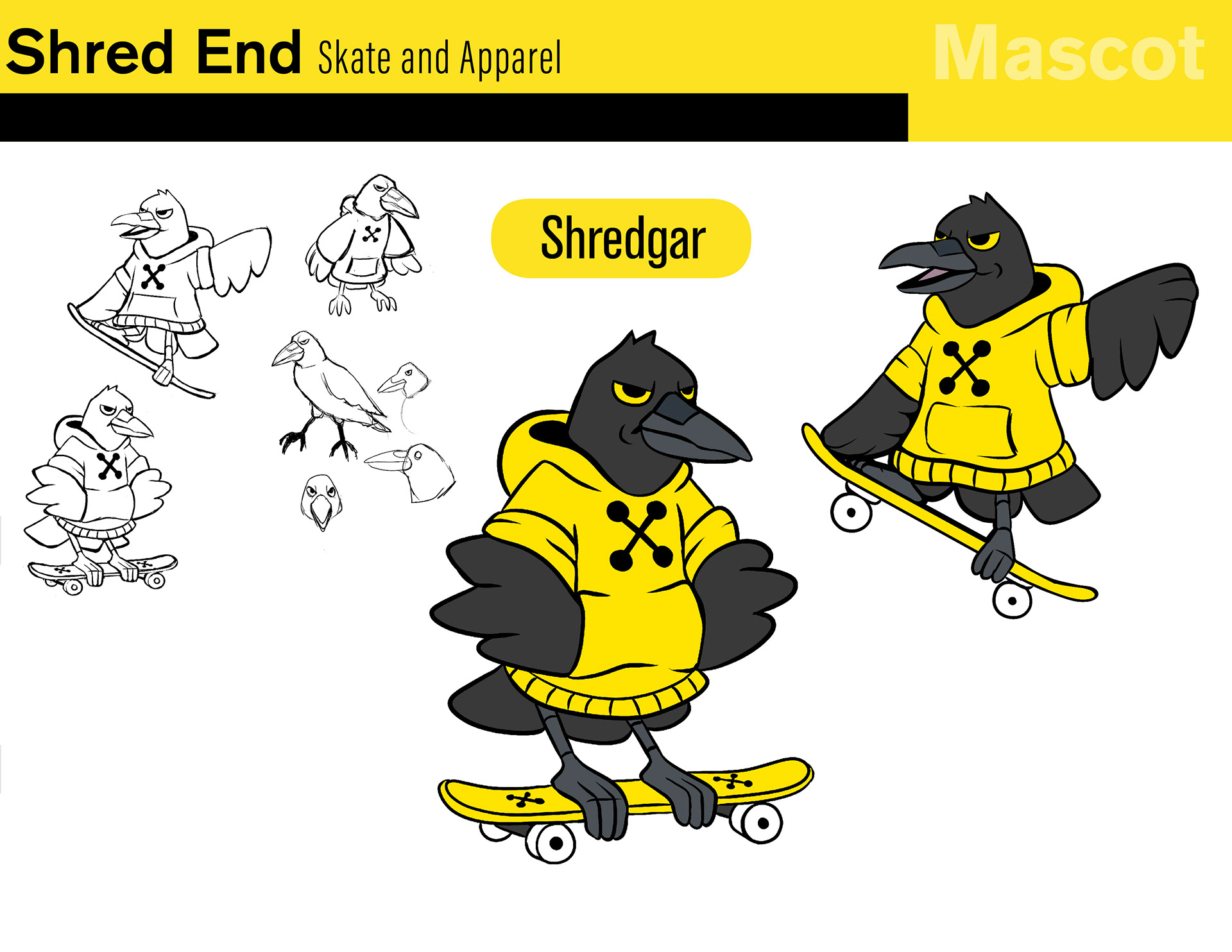
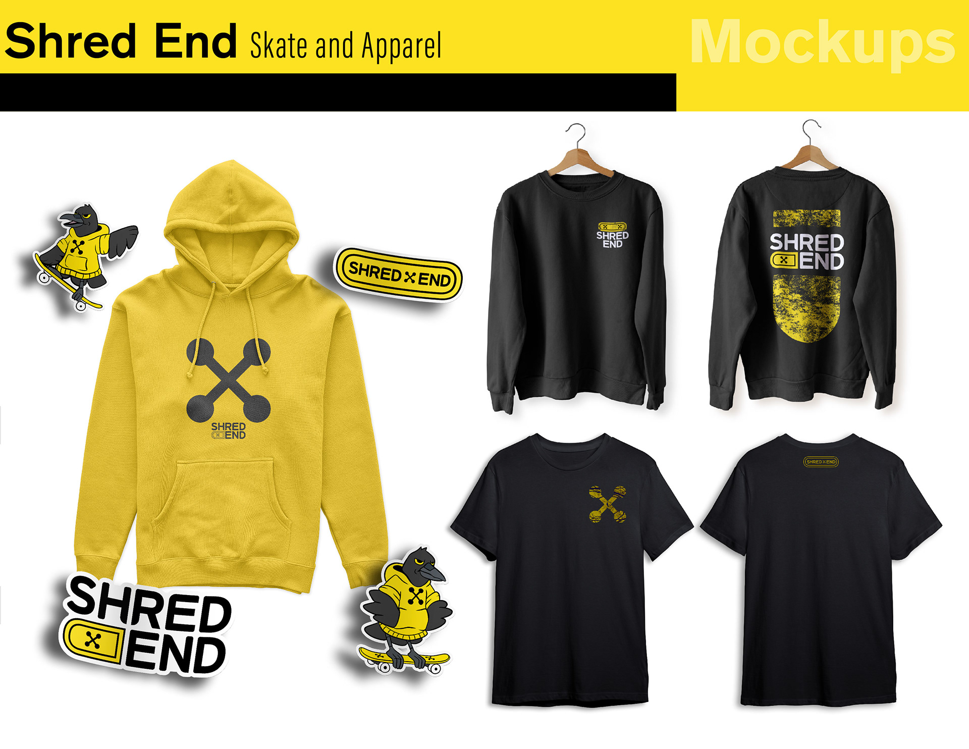
The raven mascot was chosen for their rebellious and tricky nature. The color scheme matches the brands. The name is derived from Shred and Edgar, referring to Edgar Allen Poe and his poem The Raven.
With the brand having a focus on apparel, I create a few clothing mockups to display what the brand could create.
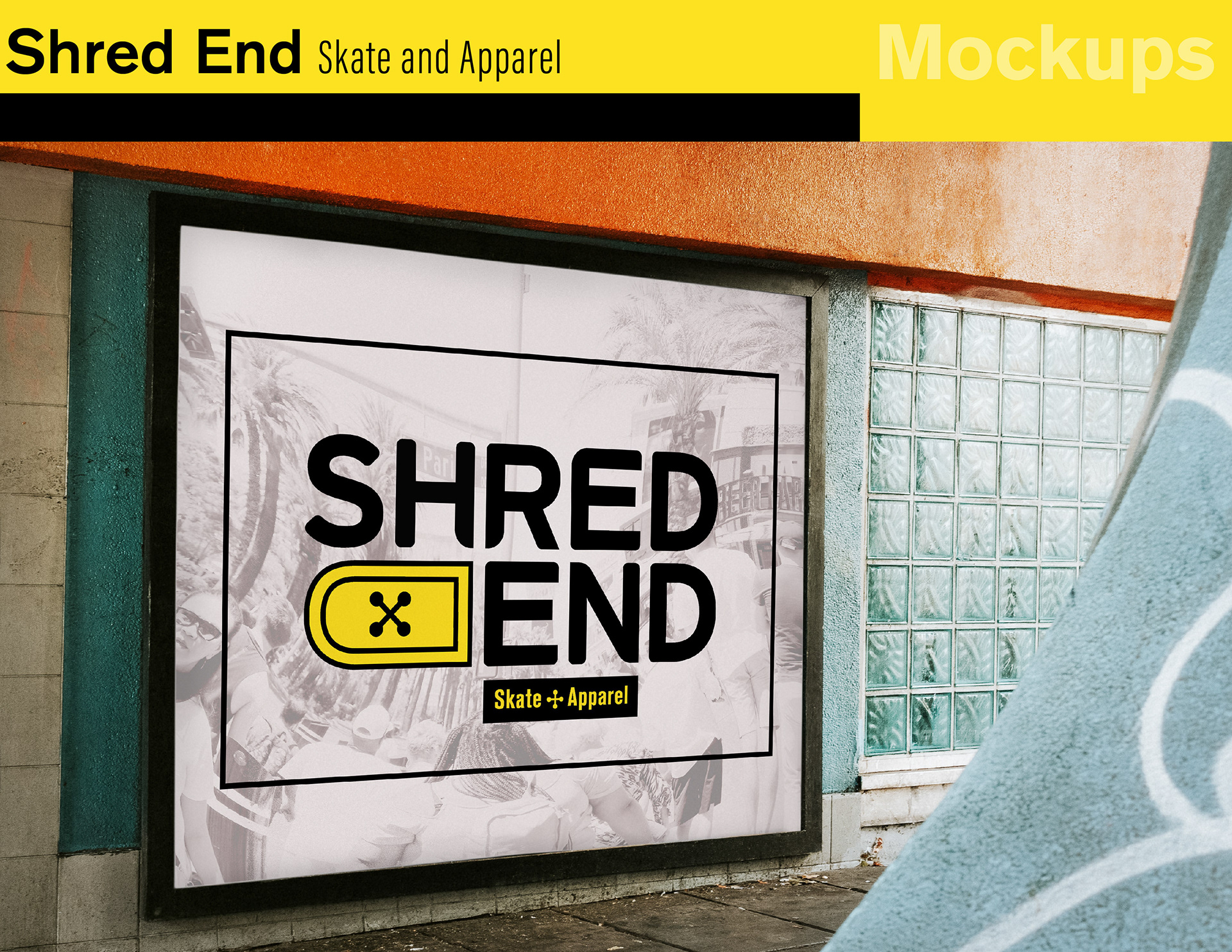
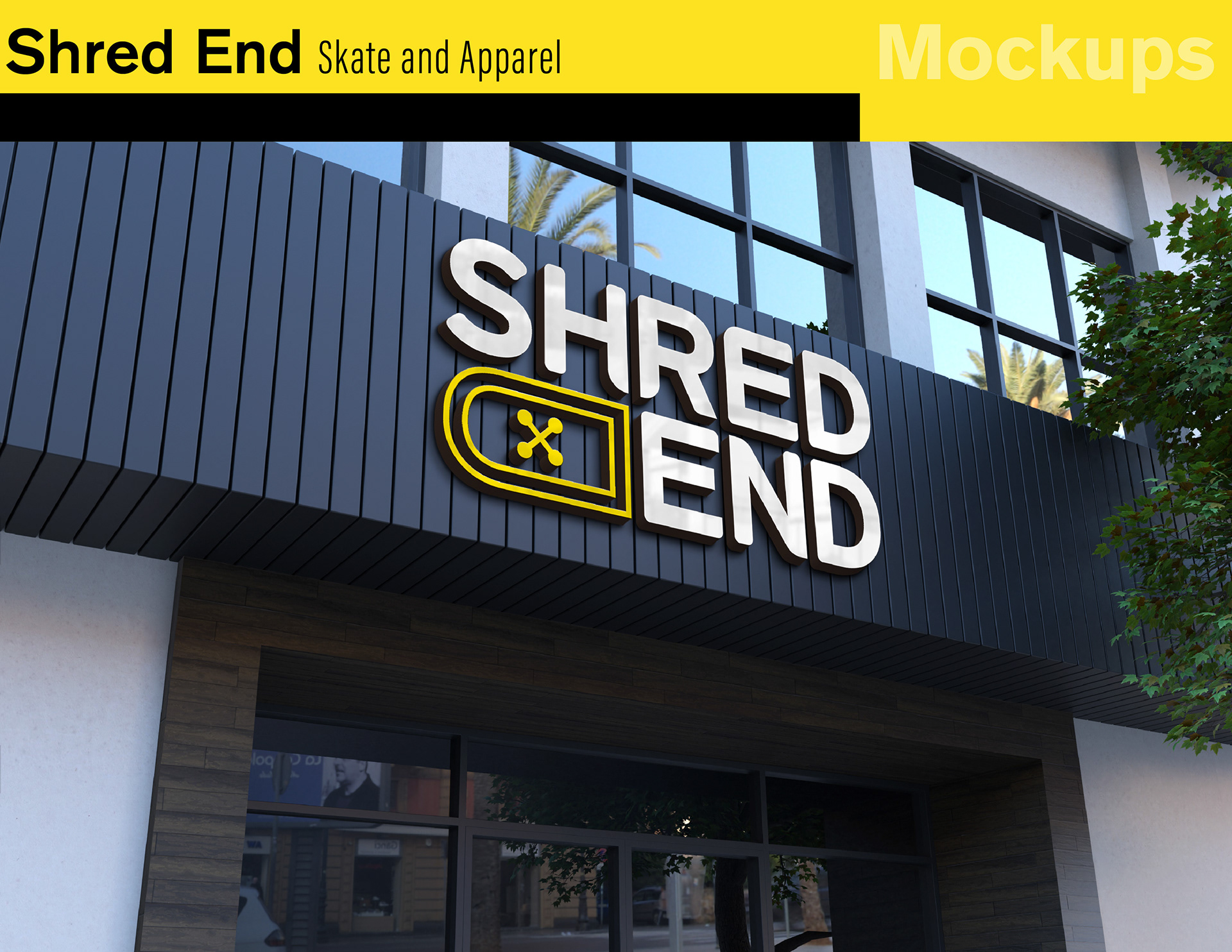
The signage and advertising mockups were created to be easily read and spark curiosity to people passing by.

